Get ready to fall in love with your kitchen all over again! A neutral backsplash is the ultimate design secret for creating a space that feels calm, chic, and endlessly versatile. Whether you’re drawn to soft sand tones, creamy stone textures, or the perfect greige harmony, neutrals bring a soothing elegance that never goes out of style. The best part? They pair beautifully with any countertop, cabinet color, or hardware finish you can dream up. From luxe sandstone to misty tile layouts, these 29 gorgeous neutral backsplash ideas will inspire you to refresh your kitchen with warmth, depth, and effortless sophistication. Let’s dive into a world of timeless beauty that makes every day in the kitchen feel like a dream!
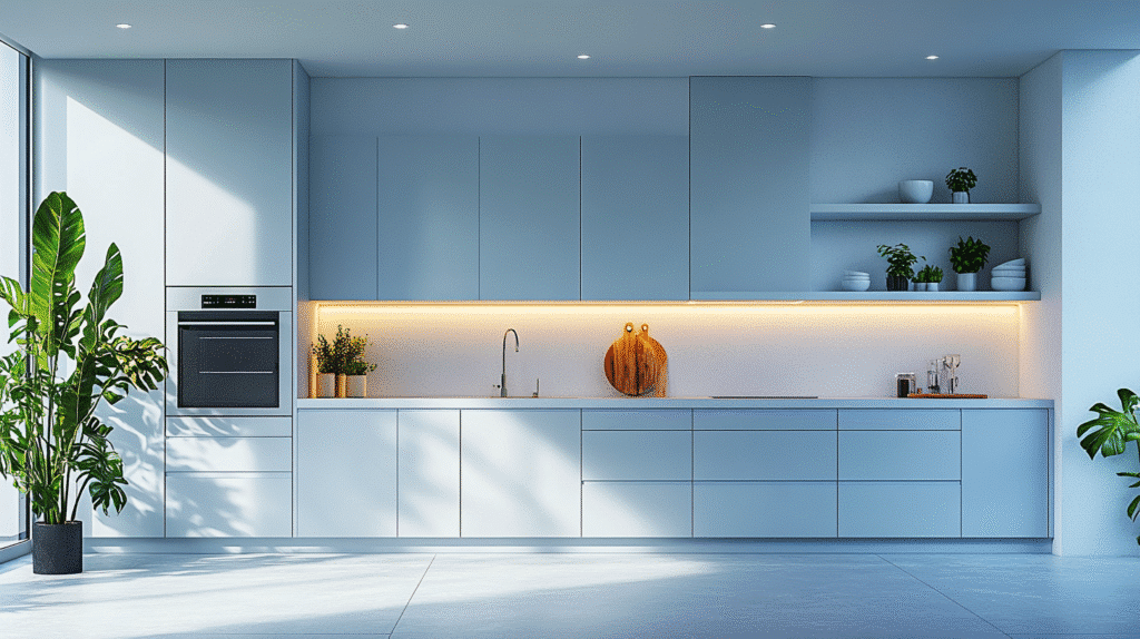
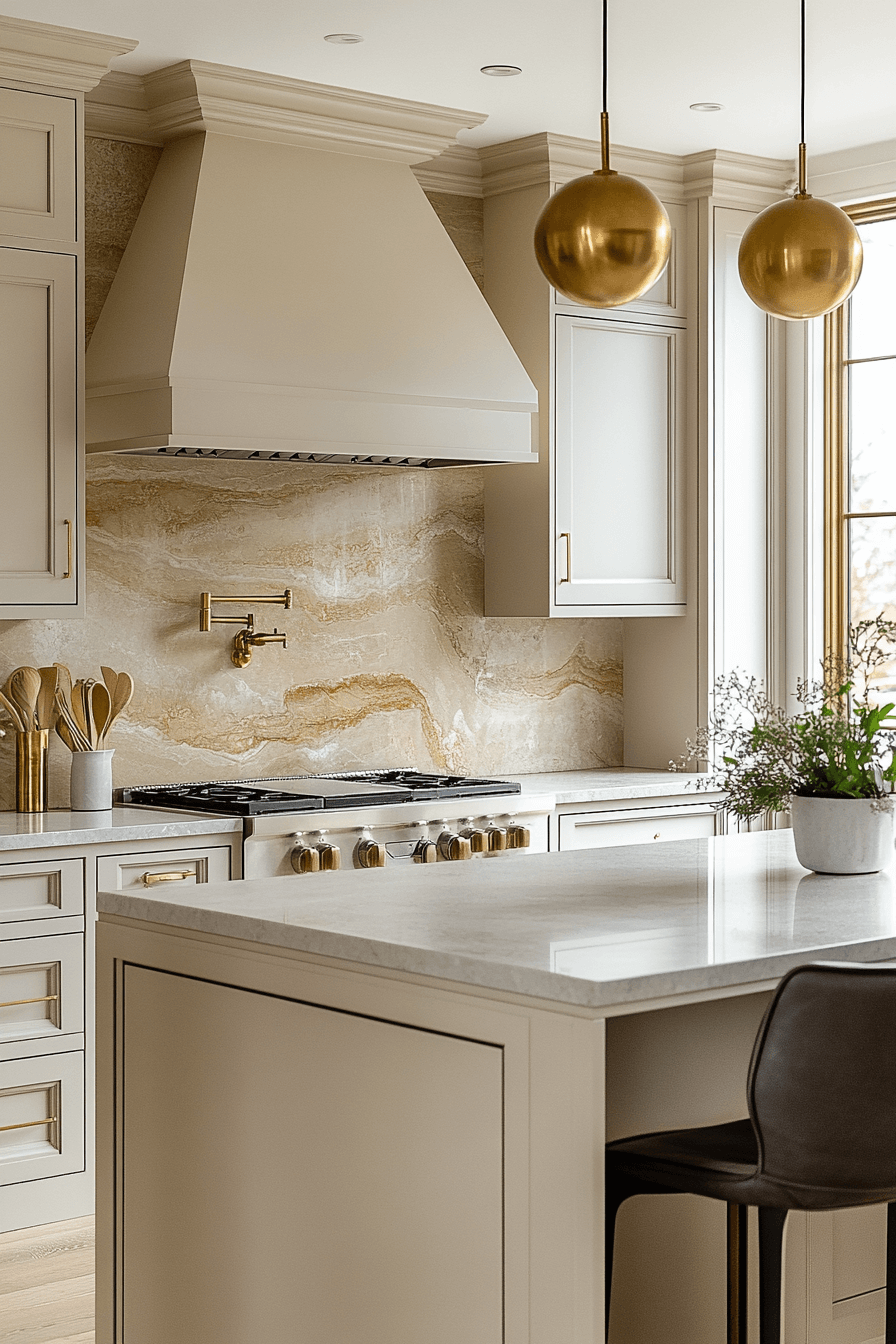
1. Soft Sand Tones
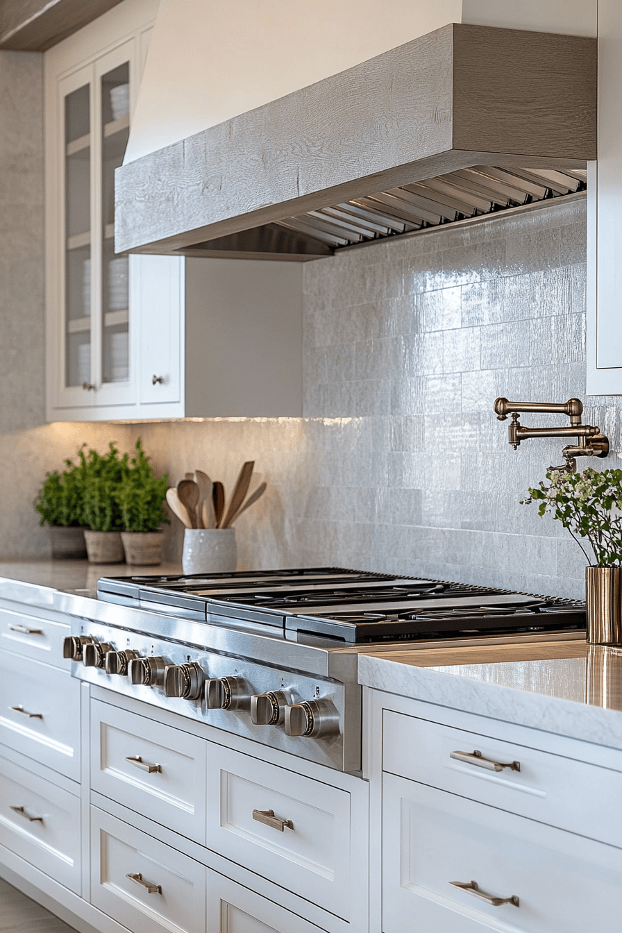
Soft sand tones bring warmth and subtlety to a neutral backsplash kitchen without overwhelming the space. This palette blends beautifully with light woods, beige cabinetry, or even cool grays. The sandy hue creates a grounding effect, perfect for calm, modern interiors. It reflects light gently, making the kitchen feel open and airy. Smooth tiles or honed stone can elevate the softness.
🌟 Steal This Look
- Paint Color: Sherwin-Williams Accessible Beige SW 7036
- Furniture: custom range hood with crown molding detail in matching cabinet finish
- Lighting: recessed can lights plus natural light from adjacent window
- Materials: light natural wood cabinetry, glossy white diamond-pattern ceramic tile, brushed brass hardware, white quartz countertop
This kitchen feels like Sunday morning calm—warm enough to feel lived-in, polished enough to host without stress.
👑 Get The Look
2. Creamy Stone Touch

A creamy stone touch delivers classic elegance in a neutral backsplash kitchen. The natural texture of stone adds organic depth while staying within a soft, neutral palette. It pairs effortlessly with both dark and light countertops. Creamy tones enhance a warm ambiance while still feeling refined. Choose a honed or matte finish for a modern effect.
✎ Steal This Look
- Paint Color: Benjamin Moore White Dove OC-17
- Furniture: custom Shaker-style base cabinet bank with integrated range surround and matching drawer stack
- Lighting: recessed LED downlights paired with under-cabinet LED strip lighting
- Materials: white marble with gray veining, brushed brass hardware, painted wood cabinetry, stainless steel
This is the kind of kitchen that makes you want to actually cook Sunday sauce from scratch, not just order takeout and pretend you did.
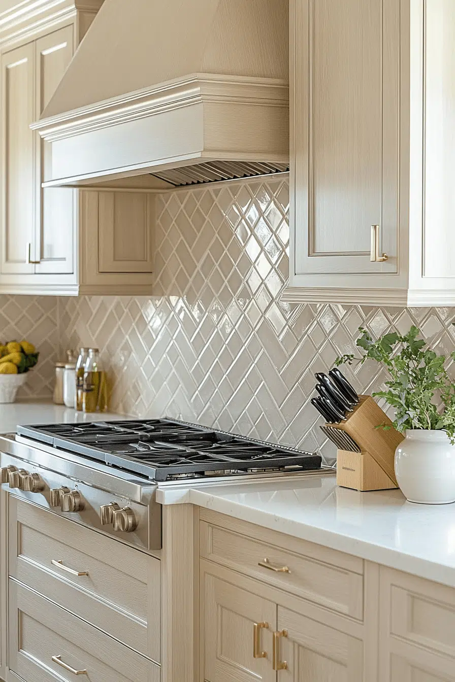
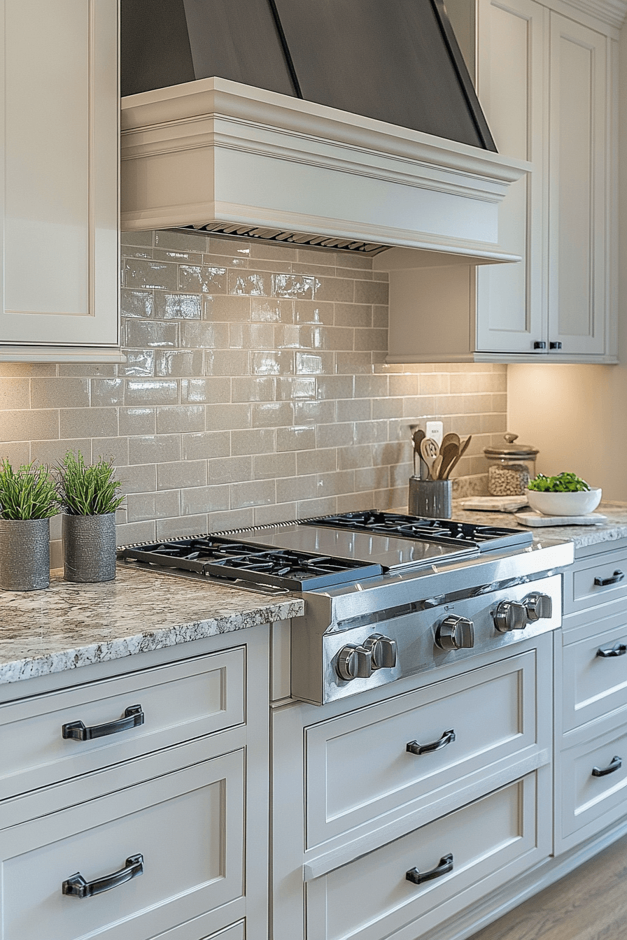
3. Almond Hue Blend

An almond hue blend brings a cozy, neutral backdrop to your kitchen without veering too yellow or too gray. This adaptable tone works well in open-concept layouts that demand continuity. Its creamy balance makes it perfect for pairing with brushed nickel or gold fixtures. Subway or herringbone tiles in this shade feel timeless. The almond base adds quiet character to the space.
🎨 Steal This Look
- Paint Color: Farrow & Ball Skimming Stone 241
- Furniture: White Shaker-style base cabinets with raised panel drawer fronts and brushed nickel bar pulls
- Lighting: Integrated LED under-cabinet strip lighting plus a custom wrapped range hood with recessed up-lighting
- Materials: Glazed ceramic subway tile backsplash, polished white quartz countertops, brushed nickel hardware, light oak flooring
This kitchen feels like Sunday morning calm—nothing shouts, everything invites. The almond-greige walls wrap the space in warmth that makes the professional range feel approachable, not intimidating.
4. Sleek Taupe Finish

A sleek taupe finish adds modern neutrality to a neutral backsplash kitchen without feeling dull. This tone is rich and refined, great for contemporary or transitional homes. Use large-format tiles for a clean and continuous look. The taupe shade adds a soft contrast to white or light cabinetry. It offers warmth without saturation.
💡 Steal This Look
- Paint Color: Behr Wheat Bread 720C-3
- Furniture: glossy flat-panel kitchen island with integrated storage
- Lighting: recessed LED downlights with under-cabinet LED strip lighting
- Materials: small-format glass mosaic tile, white quartz with subtle veining, brushed stainless steel
This kitchen feels like the calm after a busy day—there’s something deeply satisfying about the way every surface catches light differently, from the glossy cabinets to the tiny glass tiles catching those under-cabinet beams.
5. Matte Beige Charm

Matte beige charm offers effortless sophistication to a neutral backsplash kitchen. The non-glossy finish tones down light reflection while adding texture. Beige keeps the space looking clean and cozy at the same time. It’s ideal for minimalist or Japandi-inspired kitchens. This color also blends easily with wood, marble, or quartz.
🖼 Steal This Look
- Paint Color: Valspar Swiss Coffee 7002-16
- Furniture: custom range hood with crown molding detail
- Lighting: recessed LED ceiling lights with warm under-cabinet LED strips
- Materials: glossy ceramic diamond-pattern tile, quartz countertop with subtle veining, matte black metal hardware
This kitchen feels like Sunday morning coffee—calm, collected, and quietly luxurious without trying too hard.
6. Ivory Texture Flow
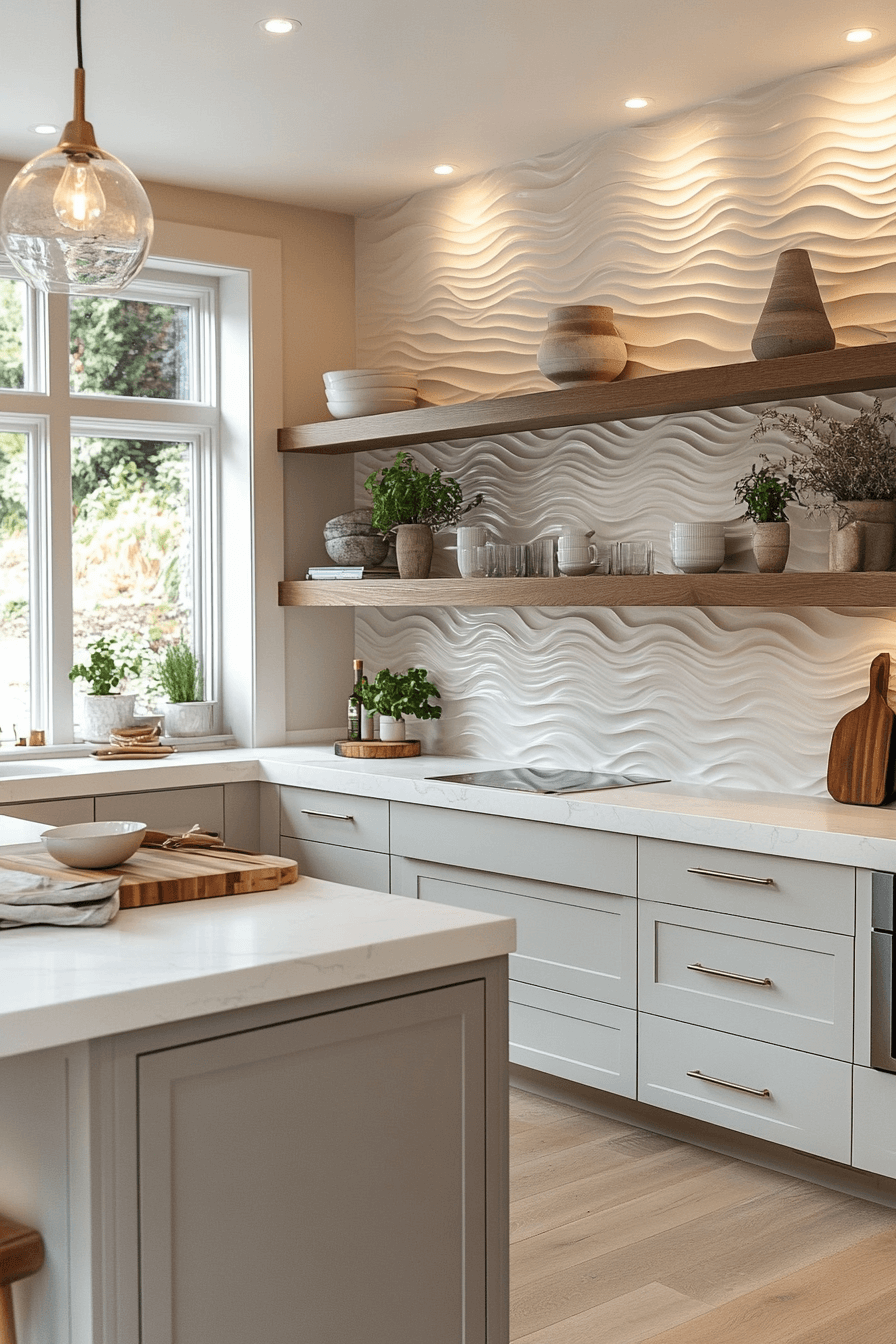
Ivory texture flow creates quiet movement across the backsplash area while staying true to a neutral palette. The soft ivory base keeps the kitchen light while textured surfaces give it depth. It feels luxurious without being loud. Perfect for soft-modern kitchens, it adds tactile interest to the walls. Combine with muted counters for a unified look.
🏠 Steal This Look
- Paint Color: PPG Delicate White PPG1001-1
- Furniture: light oak floating open shelving with hidden brackets
- Lighting: clear seeded glass globe pendant with brass hardware
- Materials: 3D wave-patterned ceramic tile, brushed brass pulls, white quartz with subtle veining
This kitchen feels like a breath of fresh air, proving that neutral doesn’t have to mean boring when you play with texture and light.
7. Cloud White Mix
A cloud white mix gives your neutral backsplash kitchen a floating, airy feel. This look is bright but not stark, thanks to subtle undertones of gray or beige. Use it in kitchens that need light enhancement without clinical white. Mix gloss and matte tiles for dimension. Cloud tones work well with stainless appliances and natural wood finishes.
💡 Steal This Look
- Paint Color: Dunn-Edwards Whisper DEW341
- Furniture: Shaker-style island base cabinet with beadboard paneling and furniture feet
- Lighting: Large clear glass globe pendant with oil-rubbed bronze chain and canopy
- Materials: Painted wood cabinetry, glossy white subway tile with dark grout, polished quartz countertop, light hardwood flooring
This kitchen feels like Sunday morning coffee—calm, collected, and quietly luxurious without trying too hard.
8. Silky Pebble Splash
Silky pebble splash introduces soft gray-beige tiles with a smooth texture that evokes natural stone. It brings balance and elegance to a neutral backsplash kitchen. The tone feels grounded, calm, and effortlessly chic. It’s an excellent match for monochrome palettes or tonal designs. Add depth by layering different tile sizes.
🎨 Steal This Look
- Paint Color: Clare Paint Fresh Kicks 01
- Furniture: custom gray-washed oak range hood with built-in ventilation
- Lighting: warm LED under-cabinet strip lighting
- Materials: glossy gray ceramic subway tile, brushed brass hardware, white marble-look quartz countertops
This kitchen feels like the sweet spot between ‘chef’s kitchen’ and ‘actually want to cook here’—the wood hood softens all that stainless steel without losing any professional edge.
9. Greige Harmony Style
Greige harmony style blends gray and beige into a peaceful, neutral backdrop for modern kitchens. The color bridges cool and warm tones, making it one of the most flexible options. Use sleek lines and seamless grout for a more contemporary look. The tone is subtle enough to complement bolder accents elsewhere. Greige works well with any flooring or cabinetry.
🏠 Steal This Look
- Paint Color: Fine Paints of Europe Hollandlac Brilliant Oyster White W1002
- Furniture: white painted shaker-style base cabinet with soft-close drawers and oil-rubbed bronze bar pulls
- Lighting: warm white LED under-cabinet strip lighting with dimmer control
- Materials: glossy greige ceramic subway tile, speckled granite countertop with gray and cream veining, brushed stainless steel range, oil-rubbed bronze hardware
This kitchen feels like the sweet spot between traditional comfort and polished sophistication, where the greige backsplash quietly does the heavy lifting so your granite and cabinetry can shine.
10. Vanilla Tile Shine

Vanilla tile shine brings a soft glow to a neutral backsplash kitchen with its warm off-white hue. A glossy finish bounces light and brightens the whole room. This color works particularly well in smaller kitchens needing a sense of openness. Pair it with bronze fixtures or creamy cabinetry. It’s subtle, inviting, and polished.
🖼 Steal This Look
- Paint Color: Backdrop Vanilla Milkshake 001
- Furniture: custom range hood with decorative corbels and shaker-style inset cabinetry
- Lighting: brass globe pendant lights with clear glass shades and visible Edison bulbs
- Materials: glossy white herringbone ceramic tile, Calacatta marble countertops, brushed brass hardware, natural wood cutting boards
This kitchen feels like Sunday morning confidence—polished enough to host, lived-in enough to actually cook in.
✓ Get The Look
11. Porcelain Slate Wall

A porcelain slate wall offers cool, understated elegance for a neutral backsplash kitchen. This shade of gray adds calm without overpowering. Porcelain tiles provide a smooth, clean surface that’s easy to maintain. It suits Scandinavian or soft-modern aesthetics beautifully. The slate tone contrasts gently with warm wood or marble.
🖼 Steal This Look
- Paint Color: Sherwin-Williams Urbane Bronze SW 7048
- Furniture: floating walnut veneer wall cabinets with horizontal grain
- Lighting: integrated LED strip under-cabinet lighting plus black stainless chimney range hood with built-in task lights
- Materials: honed charcoal porcelain slate tile, warm walnut wood with visible grain, matte black ceramic vessels
This kitchen feels like a quiet morning before the coffee kicks in—moody, grounded, and surprisingly warm once you settle into it.
12. Cashmere Surface Glow

Cashmere surface glow brings a luxurious softness to the kitchen through its warm gray-beige hue. The finish adds depth without darkening the space. Use textured tiles for extra richness or go smooth for sleek results. This shade is perfect for homeowners who want subtle elegance. Cashmere creates a cohesive feel across modern interiors.
🏠 Steal This Look
- Paint Color: Benjamin Moore Revere Pewter HC-172
- Furniture: 48-inch dual-fuel professional range with champagne bronze finish and matching range hood
- Lighting: recessed under-cabinet LED strip lighting with warm 2700K temperature
- Materials: wavy 3D marble backsplash tile, polished white quartz countertops, warm oak flooring, brushed brass hardware
There’s something quietly confident about a kitchen that lets texture do the talking—this space feels lived-in yet elevated, like the homeowner actually cooks but never stresses about the mess.
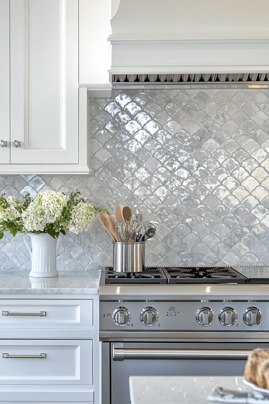
13. Misty Tile Layout
A misty tile layout introduces a pale, foggy gray that suits a minimalist neutral backsplash kitchen. The tone feels soft yet modern, perfect for matte finishes. Choose a stacked or grid layout for a structured look. Misty gray complements both bold and subtle decor. It creates an ethereal vibe that’s easy to live with.
★ Steal This Look
- Paint Color: Farrow & Ball Strong White 2001
- Furniture: custom white shaker cabinetry with polished chrome bar pulls and glass knob accents
- Lighting: integrated LED under-cabinet strip lighting plus natural window light
- Materials: iridescent fish scale ceramic tile, Carrara marble-look quartz, brushed stainless steel, polished chrome hardware
This kitchen feels like the best kind of quiet confidence—there’s nothing loud about it, yet that shimmering backsplash stops you in your tracks every time.
14. Biscotti Tile Look
Biscotti tile brings a soft, creamy brown to the neutral backsplash kitchen space. It evokes warmth and simplicity without being too dark. Use small rectangular tiles for a charming, understated effect. This hue works well with warm metals like brass or copper. The look is gentle, inviting, and very livable.
🏠 Steal This Look
- Paint Color: Behr Swiss Coffee 12
- Furniture: custom Shaker-style inset cabinetry with recessed panel doors
- Lighting: integrated LED under-cabinet lighting and natural window light
- Materials: glossy herringbone ceramic tile, Calacatta marble countertops, brushed brass hardware, white oak flooring
This kitchen feels like Sunday morning coffee with the newspaper—polished enough to impress guests but warm enough that you actually want to cook in it.
15. Polished Shell Hue

Polished shell hue delivers a pearlescent neutral with reflective elegance. The backsplash becomes a subtle statement piece in the kitchen. Use elongated tiles to emphasize width and flow. Shell tones pair well with white or pale gray cabinetry. It’s clean, calm, and ever-so-slightly glamorous.
✎ Steal This Look
- Paint Color: Valspar Filtered Shade 4003-1B
- Furniture: gray shaker-style kitchen island with vertical panel detailing
- Lighting: clear glass globe pendant lights with polished nickel hardware and Edison bulbs
- Materials: glossy gray subway tile, white marble-look quartz countertop, polished chrome fixtures
This kitchen feels like Sunday morning coffee—polished enough to impress guests but soft enough that you actually want to live in it.
16. Smooth Mocha Veil

Smooth mocha veil adds depth to a neutral backsplash kitchen without heaviness. This light brown shade has a creamy softness that feels modern. Ideal for cozy-contemporary spaces, it warms up white kitchens instantly. Use natural stone or ceramic in large formats for impact. Mocha veils bring grounded warmth without drama.
🌟 Steal This Look
- Paint Color: PPG Swiss Coffee PPG1075-1
- Furniture: custom Shaker-style painted cabinetry with raised panel upper doors
- Lighting: integrated LED strip lighting under wall cabinets plus recessed downlights
- Materials: large-format wood-look ceramic tile, polished quartz countertop, brushed stainless steel, oil-rubbed bronze hardware
This kitchen feels like the sweet spot between polished and lived-in—the warm neutrals wrap around you without trying too hard, and that wood-look tile behind the range proves you don’t need bold color to create a focal point.
17. Elegant Buff Panels
Elegant buff panels offer a refined base with a hint of color for neutral kitchen design. The muted tan shade is calming and easy to style. Opt for larger panels for a clean, seamless look. Buff pairs well with black accents or soft golds. It creates an approachable and chic setting.
✎ Steal This Look
- Paint Color: Dunn-Edwards Muslin DEW340
- Furniture: custom shaker-style island with mitered edge quartz countertop
- Lighting: 12-inch polished brass sphere pendant lights with matching brass canopy
- Materials: bookmatched natural travertine slab backsplash, brushed brass hardware, warm white quartz with subtle gray veining
This kitchen feels like Sunday morning coffee with the newspaper—warm, unhurried, and quietly luxurious without trying too hard.
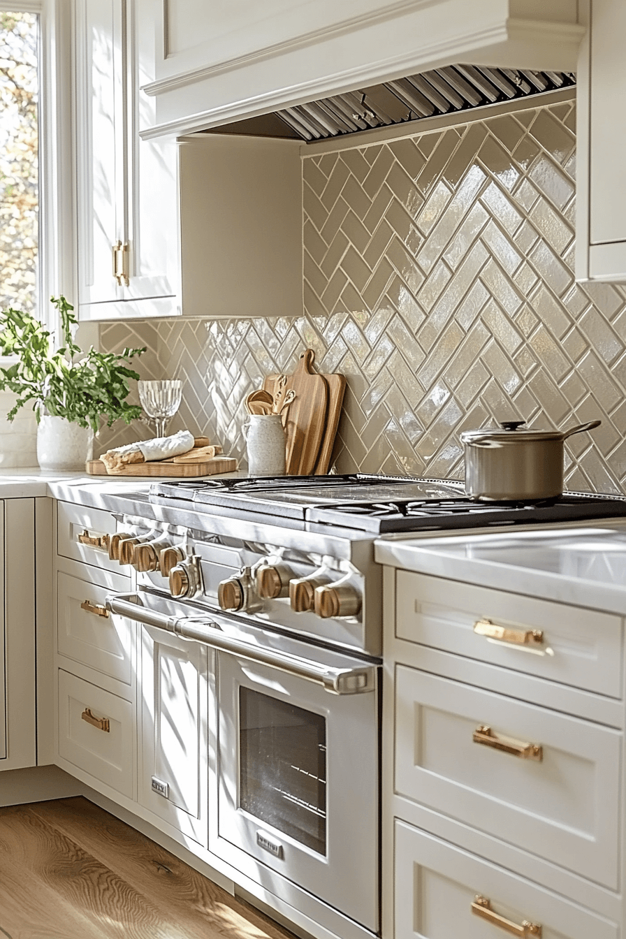
18. Parchment Pattern Blend

Parchment tiles with subtle patterns bring interest to a neutral backsplash kitchen. The design keeps things lively without bold colors. Pair with solid countertops to let the backsplash shine. This look works best in modern or transitional homes. The creamy hue keeps everything feeling clean and light.
✎ Steal This Look
- Paint Color: Clare Paint Penthouse 05
- Furniture: custom range hood with classical corbels and crown molding in matching cabinet finish
- Lighting: recessed can lights with warm white LED for even ambient illumination
- Materials: Carrara marble countertops, honey oak hardwood floors, glazed ceramic decorative tile, matte ceramic subway tile, brushed stainless steel appliances, teak cutting boards
This kitchen feels like Sunday morning calm—sophisticated enough to impress guests but warm enough that you actually want to cook in it.
19. Cozy Cloud Palette

A cozy cloud palette softens the space with barely-there grays and off-whites. This look is ideal for kitchens that aim for tranquility. Choose handmade-style tiles to add depth and charm. Cloud tones bring serenity without sacrificing sophistication. They also allow bold appliances or fixtures to take the spotlight.
🖼 Steal This Look
- Paint Color: Fine Paints of Europe ECO Eucalyptus Leaf ECO-45
- Furniture: linen-upholstered counter stools with nailhead trim and weathered wood legs
- Lighting: bronze dome pendant lights with mesh diffusers
- Materials: gray brick subway tile, white marble with soft veining, natural oak, brushed brass hardware
This kitchen feels like the kind of space where Sunday morning coffee stretches into afternoon—calm, collected, and quietly luxurious without trying too hard.
20. Pale Oat Texture

Pale oat texture brings a cereal-inspired tone to your neutral backsplash kitchen. It’s warm, organic, and deeply comforting. Use it in chevron or stacked patterns for visual texture. Pale oat hues work beautifully with matte cabinetry. The design feels handcrafted yet modern.
🌟 Steal This Look
- Paint Color: Backdrop Oat Milk 05
- Furniture: custom white painted range hood with traditional molding details
- Lighting: clear glass globe pendant with brass hardware and visible Edison bulb
- Materials: glossy herringbone ceramic tile, honed marble-look quartz, honey oak hardwood, woven jute rug, turned wood accessories
This kitchen feels like Sunday morning calm—substantial enough for serious cooking but soft enough that you actually want to linger with coffee.
21. Light Dove Splash

Light dove splash introduces a cool-gray softness perfect for modern kitchens. This hue is subtle but far from boring. Choose glass tiles for reflectivity or stone for natural depth. Dove tones are incredibly versatile, blending with nearly any palette. It keeps the room feeling expansive.
🖼 Steal This Look
- Paint Color: Sherwin-Williams Alabaster SW 7008
- Furniture: custom paneled range hood with crown molding and shaker-style white cabinetry
- Lighting: oversized bronze industrial cone pendant with chain suspension
- Materials: glossy light gray subway tile, natural oak floating shelves, white marble-look quartz with soft veining, brushed brass hardware
This kitchen feels like the kind of space where you’d actually want to cook Sunday dinner—polished enough to impress guests, but warm enough that you don’t stress about splatters.
22. Soft Suede Spread

Soft suede tiles offer a muted brown that exudes warmth in a neutral backsplash kitchen. This velvety tone adds depth without darkness. It looks rich and refined, especially in matte finishes. Combine with creamy counters and bronze hardware. Suede creates a soft cocooning effect in the space.
★ Steal This Look
- Paint Color: Benjamin Moore Kendall Charcoal HC-166
- Furniture: weathered oak kitchen island with turned legs
- Lighting: oversized brass dome pendant with vintage patina
- Materials: ceramic subway tile in charcoal matte, rift-cut white oak cabinetry, honed calacatta gold quartzite
This kitchen feels like it was designed for someone who actually cooks—every material choice balances beauty with the reality of splatters, steam, and daily wear.
23. Neutral Clay Backsplash
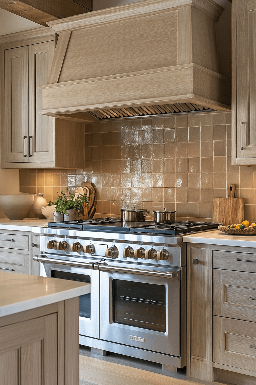
A neutral clay backsplash grounds your kitchen in warm earthy tones. This style is ideal for modern rustic or Mediterranean-inspired kitchens. Choose large slabs or tiny tiles depending on your aesthetic. The clay tone feels welcoming and authentic. It pairs well with stone counters or flat-panel cabinets.
🏠 Steal This Look
- Paint Color: Farrow & Ball Mouse’s Back 40
- Furniture: custom-built oak range hood with corbel brackets
- Lighting: warm LED under-cabinet strip lighting
- Materials: ceramic zellige tile, white oak cabinetry, natural stone countertops, exposed ceiling beams
This is the kitchen where Sunday sauces simmer for hours while everyone gathers around the island—it’s designed for people who cook seriously but want to feel wrapped in warmth, not clinical perfection.
24. Gentle Linen Hue

Gentle linen hue keeps your kitchen light and breezy with a soft beige-white tone. It’s understated and elegant, perfect for small kitchens that need visual expansion. Linen hues look best in ceramic or porcelain with a smooth finish. They’re calming, clean, and timeless. Great for pairing with minimalist decor.
🌟 Steal This Look
- Paint Color: Behr Swiss Coffee 12
- Furniture: white Shaker-style base cabinets with recessed panel doors and brushed brass bar pulls
- Lighting: natural window light with no visible fixture; supplement with recessed can lights if needed
- Materials: crackled glazed ceramic subway tile in warm taupe, white quartz countertops with subtle veining, brushed brass hardware
This kitchen feels like Sunday morning calm—nothing shouting for attention, just quiet confidence that makes you want to actually cook instead of ordering takeout again.
25. Minimal Buff Mosaic

Minimal buff mosaic tiles bring both order and visual interest to a neutral backsplash kitchen. The uniformity of the mosaic layout feels structured and tidy. Buff tones keep it grounded and warm. Great for pairing with white, wood, or concrete counters. It’s simple yet striking.
✎ Steal This Look
- Paint Color: Valspar Swiss Coffee 7002-16
- Furniture: floating oak open shelving with hidden brackets
- Lighting: brass wall sconce with clear seeded glass globe shade
- Materials: champagne glass mosaic tile, warm brass hardware, natural white oak, honed white quartz countertop
This kitchen feels like Sunday morning light—warm, unhurried, and quietly luxurious without trying too hard.
26. Luxe Sandstone Tiles

Luxe sandstone tiles create a refined natural surface for modern kitchens. Their soft beige tones feel elegant yet earthy. Choose honed finishes for a sleek, upscale look. Sandstone pairs beautifully with black fixtures or deep wood tones. It’s a go-to for those seeking timeless appeal.
🎨 Steal This Look
- Paint Color: PPG Stonehenge Greige PPG1002-3
- Furniture: traditional raised panel kitchen cabinets in deep charcoal with brushed nickel pulls
- Lighting: integrated under-cabinet LED strip lighting plus stainless steel pro-style range hood with built-in ventilation lights
- Materials: honed natural stone subway tile, travertine-look countertops, brushed nickel hardware, matte black ceramic cookware and planters
This kitchen feels like the home of someone who actually cooks—there’s lived-in warmth beneath the luxury, from the potted herbs ready for snipping to the Dutch oven waiting for Sunday dinner.
27. Warm Chalk Finish

Warm chalk finish tiles bring a light beige-white that feels soft and airy. It works best with open shelving or flat cabinetry. Use rectangular shapes to create a neat layout. Chalk tones reflect light while remaining gentle on the eyes. It’s perfect for small or dark kitchens needing brightness.
💡 Steal This Look
- Paint Color: Dunn-Edwards Swiss Coffee DEW341
- Furniture: professional-style dual fuel range with brass hardware
- Lighting: natural light maximization via large window; no visible fixture
- Materials: glossy hand-glazed ceramic subway tile, white oak floating shelves, honed quartz countertops, brass cup pulls
This kitchen feels like Sunday morning calm—it’s the kind of space that makes you want to slow down and actually enjoy stirring your coffee rather than gulping it.
28. Ash White Simplicity

Ash white simplicity delivers clean lines and crisp contrast in a neutral backsplash kitchen. This pale gray-white suits both classic and ultra-modern interiors. Pair with stainless steel or light oak. Use wide grout lines to define the shape. The tone offers effortless elegance.
🏠 Steal This Look
- Paint Color: Clare Paint Fresh Kicks 0010
- Furniture: professional-grade stainless steel gas range with brass knobs
- Lighting: integrated LED under-cabinet strip lighting
- Materials: white marble herringbone tile, brushed brass hardware, natural oak cutting boards, woven seagrass baskets
This kitchen feels like the heart of a home where Sunday morning pancakes happen—polished enough for entertaining but warm enough for everyday living.
29. Subtle Drift Appeal
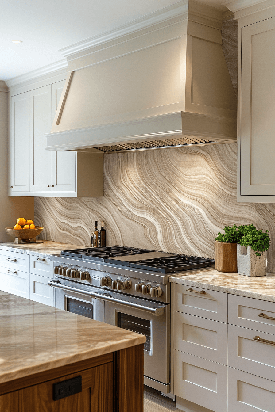
Subtle drift tones mimic natural stone colors with cool beige-gray movement. The look adds soft character without being too bold. It’s best used in slab or large-format designs. Drift tones are easy to coordinate with any palette. They feel current, calming, and practical.
Neutral backsplash kitchen ideas create a warm and calming foundation that makes the entire space feel inviting. With these 29 neutral backsplash kitchen ideas you can design a kitchen that feels timeless comfortable and easy to live in. Soft tones and subtle textures add interest while keeping the look balanced and relaxed. This versatile style pairs beautifully with many cabinet colors and finishes. Let these ideas inspire you to create a kitchen that feels peaceful and polished. Save your favorite neutral backsplash kitchen ideas and start designing a space that feels cozy welcoming and effortlessly beautiful.
🎨 Steal This Look
- Paint Color: Fine Paints of Europe Hollandlac Brilliant Cloud White W1001
- Furniture: custom white oak range hood with matching countertop waterfall edge
- Lighting: recessed warm white LED downlights with crown molding uplighting
- Materials: book-matched quartzite or marble with flowing veining, brushed brass hardware, white oak wood grain
This kitchen feels like Sunday morning confidence—polished enough to host, relaxed enough to actually cook in. The drift-toned stone brings just enough drama without demanding all the attention.