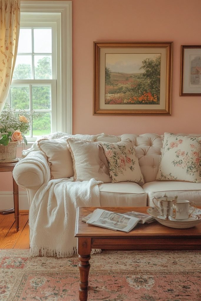
Ever wonder why pink gets a bad rap for being too girly or over-the-top? The truth is, when done right, pink can be the secret ingredient to creating a living room that’s both chic and stylish. If you’ve been hesitant to bring this bold color into your home, it’s time to think again. In this article, we’ll explore 29 pink living room ideas that will show you how to use this versatile shade to elevate your space and make it a true style statement. Ready to embrace the power of pink? Let’s dive in!
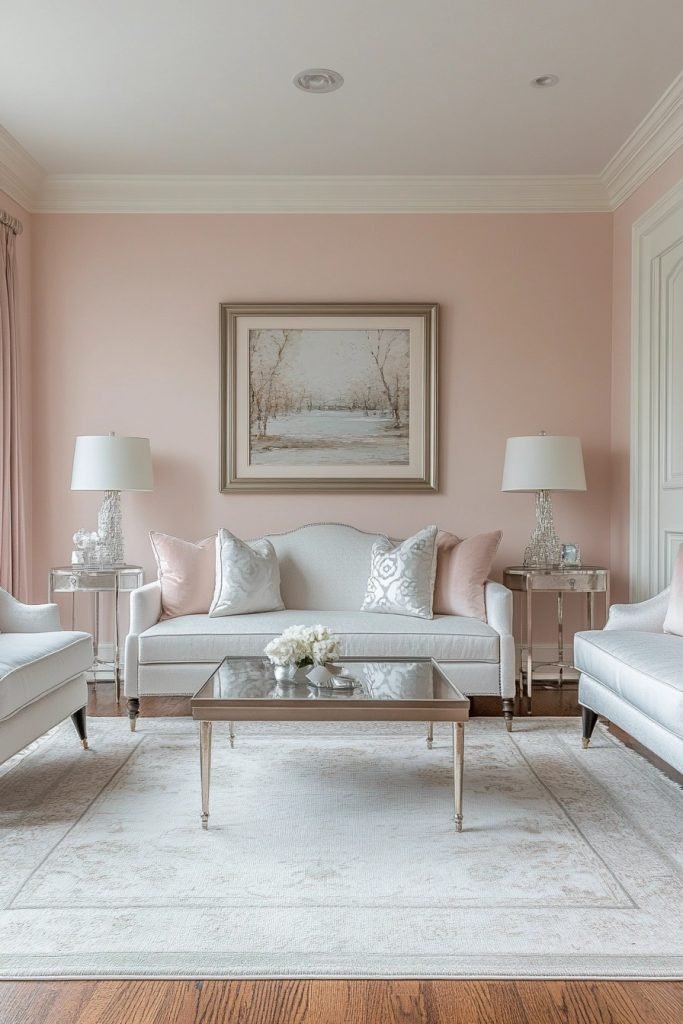
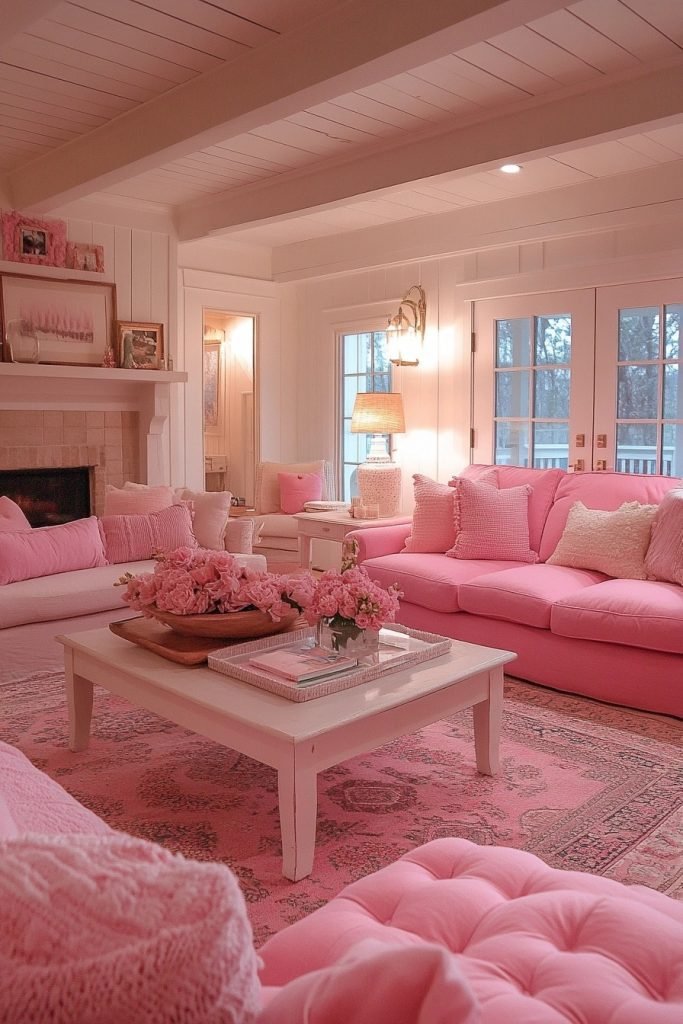
1. Blush Beauty Lounge

The Blush Beauty Lounge features soft, muted pink tones that create a serene and welcoming atmosphere, perfect for a pink living room. Elegant furnishings in complementary pastel colors enhance the soothing aesthetic, while subtle metallic accents add a touch of sophistication. This space is ideal for those seeking a calm and chic area to unwind. The use of light fabrics and delicate textures ensures the room feels airy and spacious.
🎨 Steal This Look
- Paint Color: Sherwin-Williams Intimate White SW 6322
- Furniture: Curved velvet sofa in blush pink, rounded bouclé accent chair, marble-topped coffee table with brass legs
- Lighting: Brass arc floor lamp with linen drum shade, crystal table lamp with rose gold base
- Materials: Velvet, bouclé, brushed brass, Carrara marble, sheer linen curtains
This is the pink living room for grown-ups—sophisticated enough for evening wine, soft enough for Sunday morning coffee. The metallic moments keep it from feeling too sweet.
2. Soft Rose Salon
The Soft Rose Salon is characterized by its warm, inviting pink hues that offer a comforting embrace in a pink living room setting. Plush velvet sofas and lush throws contribute to the room’s cozy vibe, making it a perfect gathering spot. Neutral accents like creams and beiges balance the richness of the rose tones, creating a harmonious space. This design works well for creating a relaxed yet elegant atmosphere.
💡 Steal This Look
- Paint Color: Benjamin Moore First Light 2102-70
- Furniture: curved velvet sofa in dusty rose, rounded armchairs with cream boucle upholstery, marble-topped coffee table with brass base
- Lighting: oversized linen drum pendant with warm brass hardware, table lamps with ceramic bases in soft white glaze
- Materials: velvet upholstery, brushed brass accents, natural linen, honed marble, wool throws
This is the pink living room for people who want elegance without edge—the kind of space where you actually want to sink in and stay awhile.
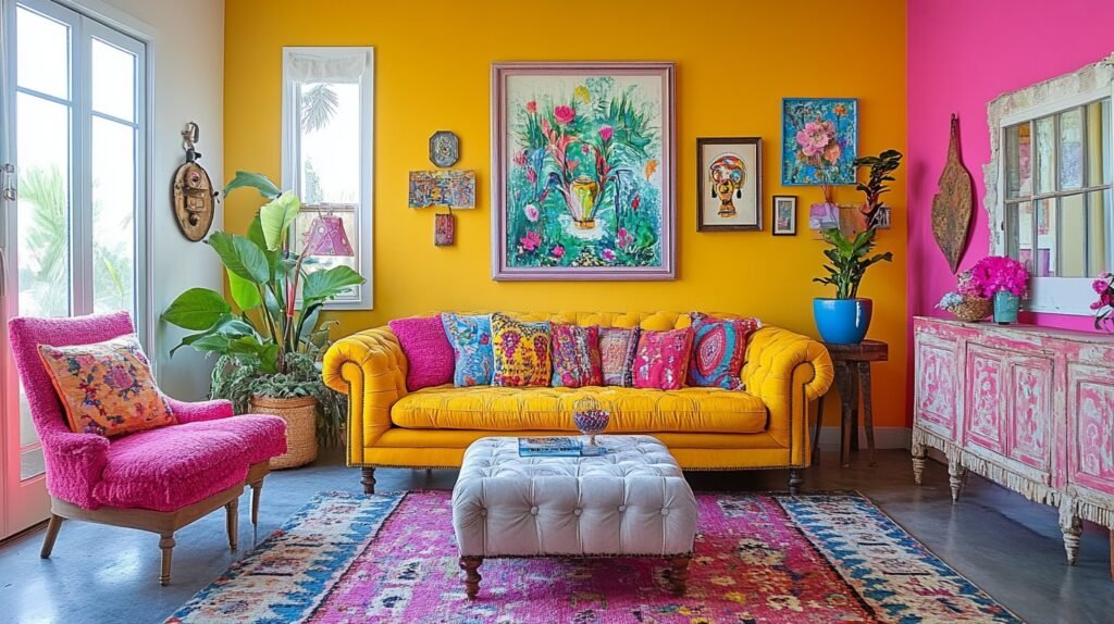
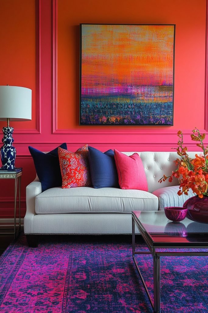
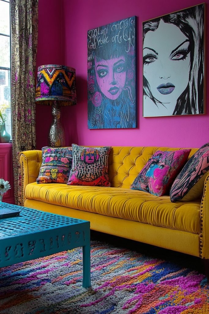
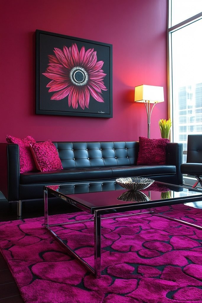
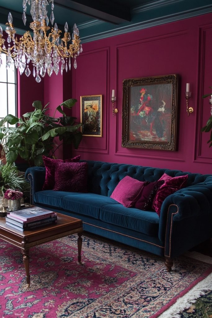
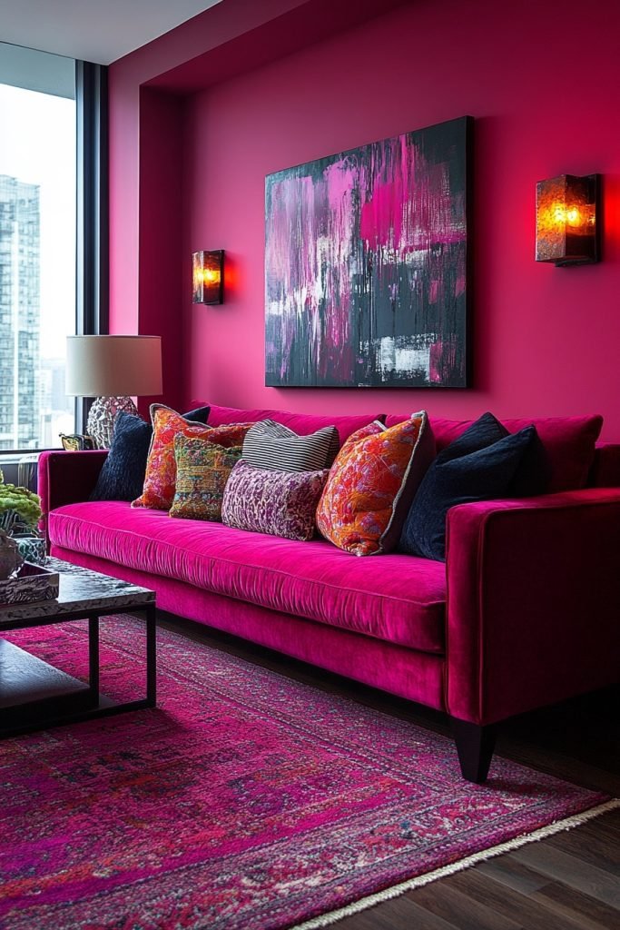
3. Fuchsia Fantasy Room
The Fuchsia Fantasy Room boasts vibrant fuchsia walls that energize the space, making it a lively and exciting pink living room. Bold, contemporary furniture contrasts with the bright walls, while modern art pieces inject personality and style. This room is designed for those who love a dynamic and spirited living environment. Accents in black or deep blue provide depth and prevent the pink from overwhelming the senses.
★ Steal This Look
- Paint Color: Farrow & Ball Rectory Red 217
- Furniture: Sleek black leather sectional with clean geometric lines, low-profile silhouette
- Lighting: Matte black arc floor lamp with oversized drum shade
- Materials: High-gloss lacquer, polished chrome, velvet, abstract canvas art
This is maximalism with intention—fuchsia demands confidence, but the payoff is a living room that actually sparks joy every time you walk in. I’ve seen this work beautifully in north-facing rooms where the cool light tempers the heat of the pink.
4. Pastel Pink Paradise
The Pastel Pink Paradise utilizes soft, pastel pink shades to create a tranquil and dreamy pink living room. The inclusion of white and light wooden furniture enhances the gentle and airy feel, making it perfect for relaxation and casual entertaining. Floral patterns or soft geometric prints add interest without disrupting the peaceful vibe. This room is an ideal choice for those seeking a gentle and inviting space.
🖼 Steal This Look
- Paint Color: Behr Rose Water MQ3-01
- Furniture: white slipcovered sofa, light oak coffee table with tapered legs, whitewashed media console
- Lighting: natural linen drum pendant with brass accents
- Materials: bleached oak, matte white ceramic, soft cotton canvas, brushed brass
This is the pink living room for people who think they hate pink—it’s barely there, like sunrise light filtering through curtains, and somehow makes every afternoon feel like a slow Sunday.
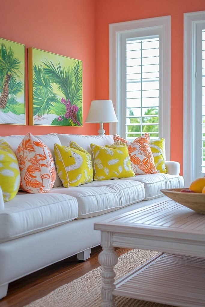
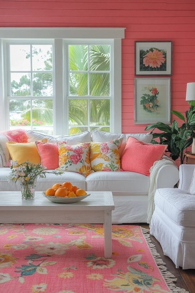
5. Coral Charm Living Space
In the Coral Charm Living Space, vibrant coral pink walls are paired with tropical accents to create a warm, inviting pink living room. Furniture in natural textures like rattan and linen complements the energetic coral, enhancing the room’s sunny disposition. This setup is great for those who appreciate a beachy, vibrant aesthetic. Strategic pops of green in accessories can add a fresh contrast to the coral.
★ Steal This Look
- Paint Color: Valspar Coral Reef 2002-4A
- Furniture: rattan accent chair with natural cane weave, linen slipcovered sofa in warm white
- Lighting: natural rattan pendant shade with warm brass hardware
- Materials: woven rattan, bleached linen, seagrass, light oak, terracotta ceramics
This coral pink living room feels like a permanent vacation—I’d add a vintage bamboo bar cart to really lean into that 1970s coastal nostalgia.
🌊 Get The Look
6. Bubblegum Bliss Living Area
The Bubblegum Bliss Living Area features bold bubblegum pink tones that infuse the room with fun and youthful energy, ideal for a playful pink living room. Contemporary furniture in white or gray balances the brightness and keeps the space modern. Colorful pop art and quirky decor items celebrate the lively color scheme. This room is perfect for those who enjoy a cheerful and vibrant living space.
★ Steal This Look
- Paint Color: PPG Pink Flamingo PPG1182-3
- Furniture: Streamlined white or light gray contemporary sofas with clean lines, low-profile coffee tables in white lacquer or brushed nickel
- Lighting: Sculptural white pendant or floor lamp with geometric shape to anchor the modern aesthetic
- Materials: High-gloss white surfaces, brushed metal accents, smooth velvet or performance fabric upholstery, acrylic or lucite decorative objects
This look demands confidence—commit fully to the pink or it reads as indecisive. I’ve seen homeowners chicken out at 80% and regret the half-measure.
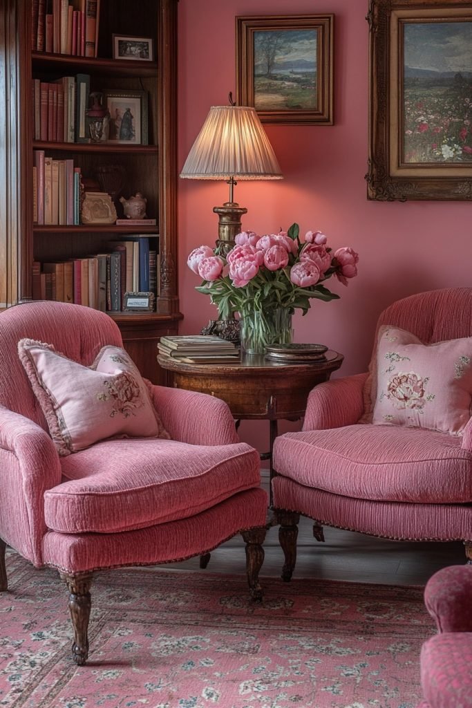
7. Peony Pink Panorama
The Peony Pink Panorama offers a soft, floral-inspired pink setting that is both comforting and sophisticated for a pink living room. Luxurious textures like silk and velvet add a layer of opulence, while elegant gold accents provide a refined finish. This space is designed for relaxation and quiet conversation, making it ideal for hosting guests. Floral accents and soft lighting enhance the romantic, garden-like feel.
🏠 Steal This Look
- Paint Color: Dunn-Edwards Peony Pink DE5057
- Furniture: blush velvet sofa with rolled arms, silk-upholstered accent chairs, antique gold coffee table with marble top
- Lighting: crystal chandelier with warm dimmable bulbs, brass table lamps with silk shades
- Materials: silk drapery panels, velvet upholstery, brushed gold metal finishes, fresh peony arrangements, marble accents
This is the pink living room for grown-ups—soft enough to feel nurturing, luxurious enough to feel special. I love how the gold elevates it from sweet to seriously sophisticated.
8. Salmon Splendor Sitting Room
The Salmon Splendor Sitting Room utilizes rich salmon pink hues to create a warm and welcoming pink living room. Mid-century modern furniture in dark wood tones complements the salmon, adding a vintage flair. The room balances modernity and nostalgia, making it perfect for those who appreciate a retro-modern mix. Soft, plush textiles ensure the room is inviting and comfortable.
🖼 Steal This Look
- Paint Color: Clare Paint Blushing Babe CW-05
- Furniture: Mid-century modern sofa with tapered dark walnut legs, low-profile walnut credenza, sculptural dark wood accent chair
- Lighting: Sputnik brass chandelier with globe bulbs, arched brass floor lamp with linen shade
- Materials: Dark walnut wood, velvet upholstery in deep coral, brass metal accents, chunky knit wool throws, linen drapery
There’s something undeniably cozy about a pink room that doesn’t apologize for itself—this salmon shade feels like a sunset you can live inside.
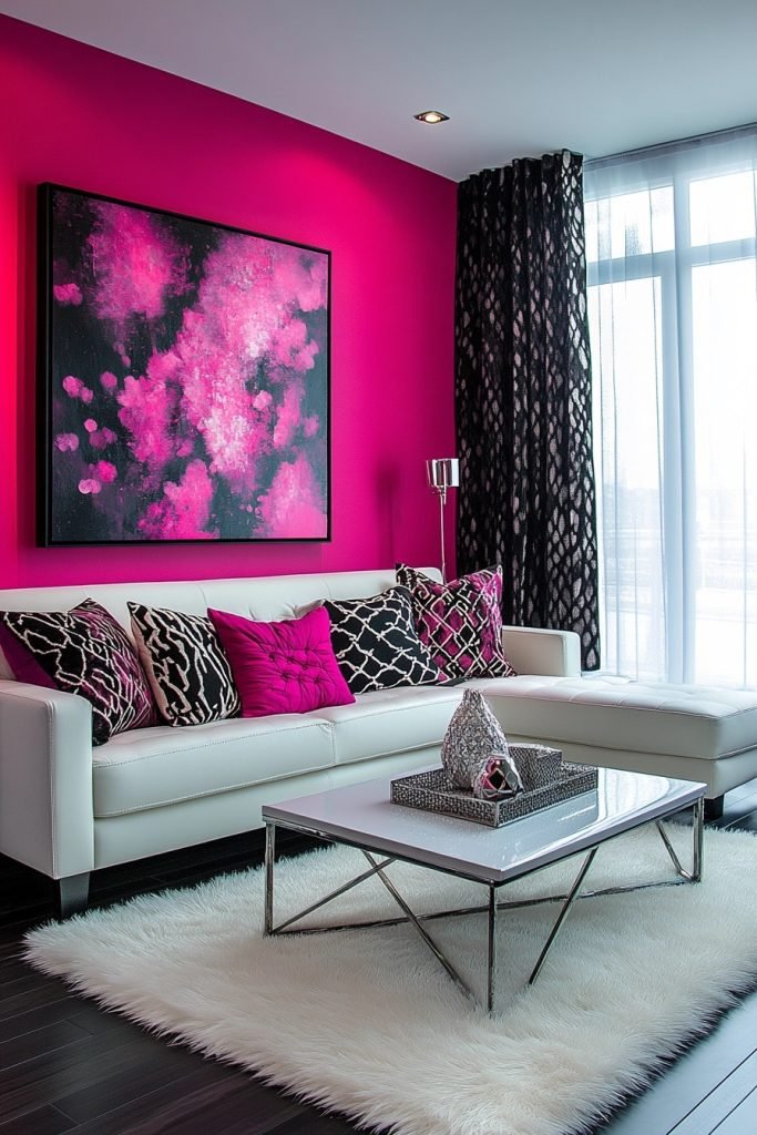
9. Hot Pink Haven
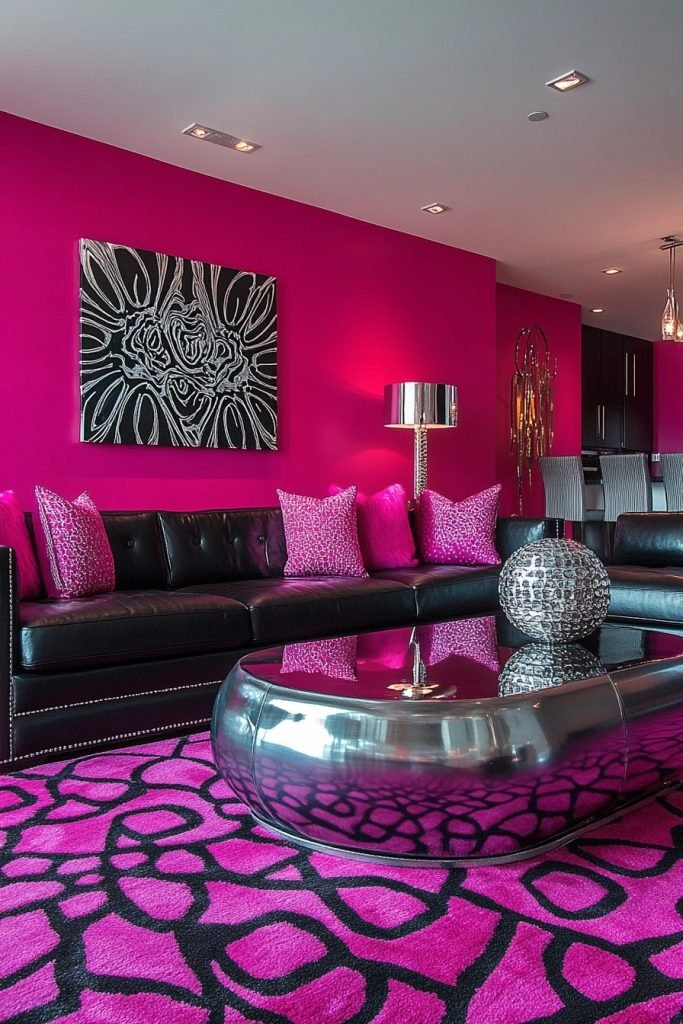
The Hot Pink Haven is designed for those who love bold statements, featuring vibrant hot pink walls and accents in a pink living room. Modern furniture in minimalist designs ensures that the color remains the focal point. Black and white art and photographs on the walls provide a visual break, making the space more dynamic and stylish. This living room is suited for energetic personalities and vibrant lifestyles.
★ Steal This Look
- Paint Color: Fine Paints of Europe Hollandlac Brilliant Hot Pink 4003
- Furniture: Low-profile modular sofa in crisp white bouclé, black lacquer nesting coffee tables, minimalist black metal floor lamp
- Lighting: Matte black adjustable arc floor lamp with white drum shade
- Materials: High-gloss painted walls, matte black metal, white textured bouclé, glass and lacquer accents
This look demands commitment—I’ve seen timid half-measures fall flat, but when you fully embrace the saturation with disciplined neutrals, it becomes unforgettable.
10. Rose Quartz Retreat
The Rose Quartz Retreat centers around the gentle and healing tones of rose quartz, creating a soothing and therapeutic pink living room. The use of soft, flowing fabrics and minimalistic decor promotes a sense of peace and well-being. Light wooden elements and creamy whites complement the soft pink, enhancing the serene atmosphere. This room is perfect for those seeking a calm oasis for relaxation and rejuvenation.
🎨 Steal This Look
- Paint Color: Backdrop Pink Ground 202
- Furniture: low-profile cream linen sofa, light oak coffee table with rounded edges, minimalist wooden side tables
- Lighting: sheer white linen pendant with warm diffused glow, natural light maximization
- Materials: rose quartz stone accents, raw silk and linen textiles, bleached oak, matte ceramic, flowing sheer curtains
This is the room you sink into after a long day—soft, unhurried, almost like a breath held in slow motion. The rose quartz isn’t trendy here; it’s intentional healing.
11. Magenta Mood Studio
The Magenta Mood Studio employs deep magenta tones to craft a dramatic and passionate pink living room. Bold, expressive art pieces and contemporary furniture in sleek black or chrome stand out against the magenta backdrop. This room is designed for those who embrace bold colors and modern aesthetics. Accents in grey or navy can help temper the intensity of the magenta, creating a balanced space.
🖼 Steal This Look
- Paint Color: Sherwin-Williams Rave Red SW 6608
- Furniture: Low-profile black leather sectional with chrome legs, sculptural chrome accent chair
- Lighting: Geometric chrome pendant cluster or sputnik chandelier
- Materials: High-gloss lacquer, polished chrome, black leather, raw canvas art
This is the pink living room for someone who treats their space like a gallery—magenta demands confidence, and the chrome-black pairing keeps it editorial rather than playful.
12. Flamingo Flush Family Room
In the Flamingo Flush Family Room, playful shades of flamingo pink are paired with casual, comfortable furnishings, making it an inviting pink living room for family gatherings. Beach-inspired decor and light, sandy textures complement the flamingo pink, adding a laid-back, vacation-like feel. This space is ideal for informal socializing and family time, providing a cheerful and relaxed atmosphere. Soft, natural fabrics and casual seating arrangements enhance the room’s welcoming vibe.
★ Steal This Look
- Paint Color: Benjamin Moore Flamingo’s Dream 2083-50
- Furniture: Low-slung linen slipcovered sofa in natural oatmeal, whitewashed rattan accent chairs, driftwood coffee table
- Lighting: Woven seagrass pendant or capiz shell chandelier for soft, diffused coastal glow
- Materials: Raw linen, bleached wood, woven jute, weathered driftwood, coral accents
This is the pink living room for people who think they hate pink—it’s sun-faded, salt-washed, and utterly unpretentious. The beachy textures keep the bold color grounded and livable.
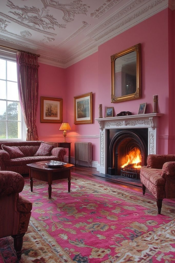
13. Raspberry Radiance Room
The Raspberry Radiance Room features rich raspberry pink walls that add a luxurious and vibrant touch to the pink living room. Dark wooden furniture and rich, patterned fabrics provide depth and contrast, creating a sophisticated space. This room is perfect for those who prefer a regal and warm environment, with colors that stimulate and enrich the senses. Accent lighting and metallic finishes can amplify the radiance of the raspberry tones.
🎨 Steal This Look
- Paint Color: Farrow & Ball Rectory Red 217
- Furniture: Dark mahogany Chesterfield sofa, carved walnut side tables, antique brass étagère
- Lighting: Ornate brass chandelier with amber glass shades, sculptural brass floor lamp with linen drum shade
- Materials: Deep raspberry velvet, burnished brass, dark stained oak, damask and brocade textiles, aged mercury glass
This is the room for someone who drinks red wine at four o’clock and owns a proper decanter. The raspberry reads dramatic, not juvenile, because everything else whispers old money.
14. Strawberry Silk Salon
The Strawberry Silk Salon is adorned with soft strawberry pink tones and luxurious silk draperies, providing an elegant and refined pink living room. Classic furniture in light, neutral tones contrasts beautifully with the strawberry pink, offering a timeless appeal. Crystal chandeliers and polished silver accessories lend an air of sophistication and glamour. This salon is ideal for formal entertaining or quiet, chic relaxation.
🎨 Steal This Look
- Paint Color: Behr Strawberry Cream MQ1-32
- Furniture: Tufted cream velvet sofa with rolled arms, antique white French provincial armchairs, marble-top coffee table with silver legs
- Lighting: Ornate crystal chandelier with polished chrome accents, silver candelabra table lamps with silk shades
- Materials: Silk drapery panels, polished silver mirror frames, velvet upholstery, marble surfaces, crystal accents
There’s something undeniably romantic about a pink salon that doesn’t apologize for its femininity—this look whispers old Hollywood dressing room in the best way.
15. Dusky Pink Dream
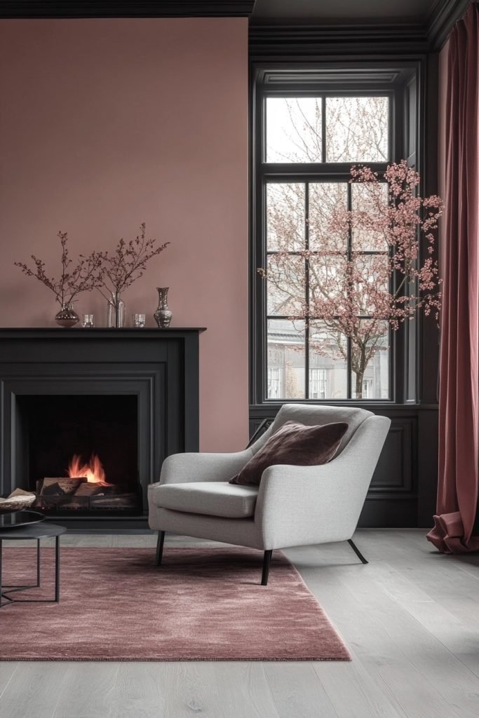
The Dusky Pink Dream creates a muted, dreamy atmosphere in a pink living room with dusky pink walls and subdued lighting. Furniture in complementary shades of grey and taupe enhances the softness of the dusky pink, making the space ideal for relaxation and introspection. This room is perfect for those seeking a gentle, understated retreat from the bustling outside world. Soft textiles and minimal decor help maintain the dreamy quality of the room.
★ Steal This Look
- Paint Color: Valspar Dusky Blush 2003-6B
- Furniture: low-profile taupe linen sofa, grey velvet armchair, whitewashed oak coffee table
- Lighting: frosted glass globe floor lamp with warm dimmable LED
- Materials: brushed brass accents, raw linen, unbleached cotton, pale oak
There’s something almost meditative about a room that refuses to shout—this is the visual equivalent of a deep exhale after a chaotic day.
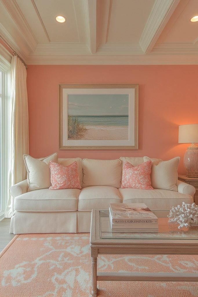
16. Peach Pink Ensemble
The Peach Pink Ensemble features warm peach pink tones that imbue the pink living room with a cheerful and inviting ambiance. Accents in soft yellows and creams complement the peach tones, creating a sunny, welcoming space. This living room is great for lively conversations and joyful gatherings, with a color palette that lifts spirits and warms the heart. Casual, comfortable furniture and playful patterns reflect the light-hearted nature of the peach pink.
🏠 Steal This Look
- Paint Color: PPG Peach Echo PPG1194-3
- Furniture: curved cream boucle sofa, rounded peach velvet accent chair, light oak coffee table with soft edges
- Lighting: brass sputnik chandelier with frosted glass globes, warm 2700K bulbs
- Materials: matte velvet, natural oak, brushed brass, woven rattan, linen blend textiles
This is the living room that actually makes you want to host brunch—it’s optimistic without being saccharine, like your most effortlessly charming friend.
17. Cherry Blossom Chamber
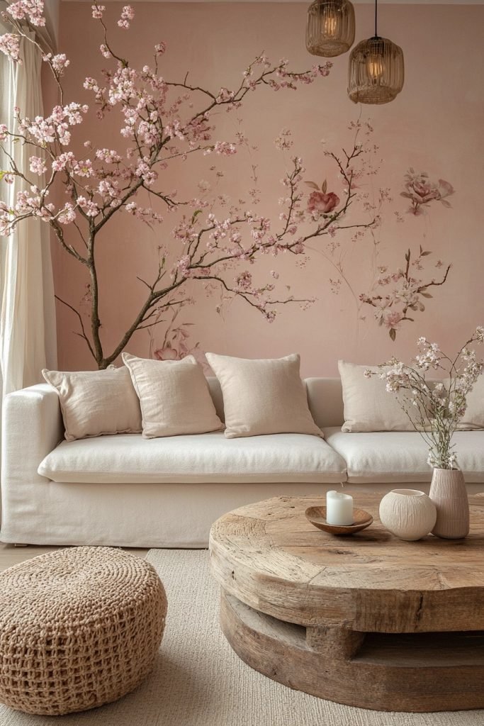
The Cherry Blossom Chamber is inspired by the delicate pinks of cherry blossoms, creating a serene and beautiful pink living room. Subtle floral patterns and soft textures mirror the ephemeral beauty of cherry blossoms, enhancing the room’s tranquil feel. Furniture is understated and elegant, in shades of white and soft grey, allowing the cherry blossom-inspired colors to stand out. This room is perfect for those who appreciate the subtle beauty of nature and a soft, calming color palette.
✎ Steal This Look
- Paint Color: Dunn-Edwards Pink Blush DET435
- Furniture: white linen sofa with curved arms, soft grey velvet accent chair, bleached oak coffee table
- Lighting: brass floor lamp with linen drum shade, paper lantern pendant
- Materials: raw silk curtains, cherry blossom branch arrangements, watercolor floral wallpaper, brushed brass hardware
This room whispers rather than shouts—it’s for mornings with tea and poetry, not for bold entertaining.
18. Rosé Reverie
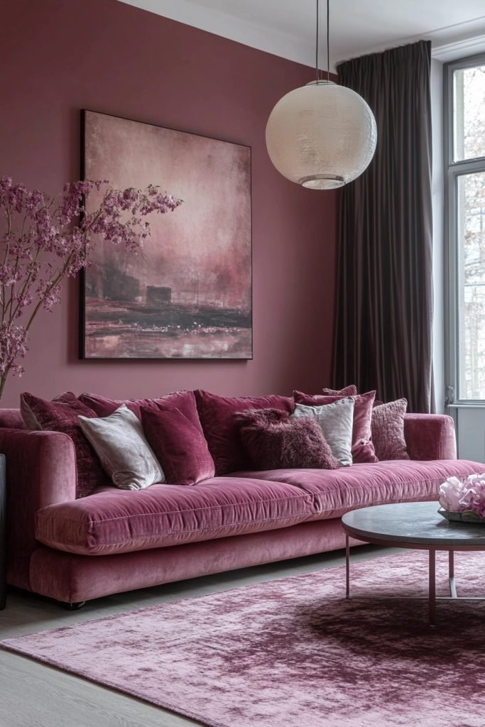
The Rosé Reverie is a pink living room designed with the hues of rosé wine, offering a sophisticated and inviting space. Velvet sofas in deeper shades of pink and wine-red accents create a luxurious and cozy atmosphere. This room is ideal for evenings of relaxation and conversation, with a color scheme that suggests elegance and comfort. Gold or brass elements add a touch of luxury, enhancing the rosé theme.
✎ Steal This Look
- Paint Color: Clare Paint Rosé Season 0018
- Furniture: deep rose velvet sofa, wine-red accent armchair, brass-legged coffee table
- Lighting: brass arc floor lamp with linen shade, crystal chandelier with warm glow
- Materials: velvet upholstery, brushed brass, marble, silk drapery
This is the living room equivalent of a perfect glass of Provence rosé—effortlessly elegant, slightly unexpected, and impossible not to relax into. The brass against those deeper pinks feels like sunset in a bottle.
19. Sweet Pea Pink Parlor
The Sweet Pea Pink Parlor utilizes the light and playful tones of sweet pea flowers to create a charming and youthful pink living room. Whimsical decorations and casual, eclectic furniture make the space lively and fun. This parlor is great for creative activities or casual socializing, with a decor that encourages playfulness and creativity. Pastel accents and whimsical patterns add to the room’s light-hearted feel.
🌟 Steal This Look
- Paint Color: Fine Paints of Europe Sweet Pea Pink FPE-1847
- Furniture: Vintage-inspired velvet settee in blush pink, mismatched painted accent chairs in mint and lavender, whitewashed spindle coffee table
- Lighting: Capiz shell chandelier with soft pink undertones, ceramic table lamps with floral bases
- Materials: Distressed whitewashed wood, matte ceramic, soft velvet, capiz shells, floral cotton prints
This room feels like Sunday morning sketching with coffee—unbuttoned, sun-drenched, and quietly optimistic. The sweet pea palette rewards the brave who commit fully rather than dipping a toe.
20. Cotton Candy Comfort Zone
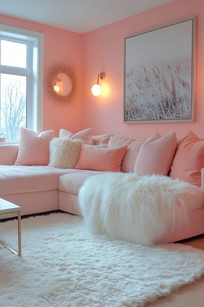
The Cotton Candy Comfort Zone features soft, fluffy textures and sweet cotton candy pink colors, creating a cozy and delightful pink living room. Plush rugs, oversized cushions, and comfortable seating invite relaxation and casual lounging. This room is perfect for family movie nights or curling up with a good book, with a design that emphasizes comfort and warmth. Light woods and fluffy textiles maintain the soft, inviting atmosphere.
💡 Steal This Look
- Paint Color: Backdrop Pink Ground 2002-40
- Furniture: oversized sectional sofa in cream boucle, round pouf ottomans, low-profile media console in bleached oak
- Lighting: oversized paper lantern pendant with warm dimmable bulb
- Materials: shag wool rugs, faux fur throws, velvet cushions, light oak wood, cotton canvas
This is the living room equivalent of a warm hug—lean all the way into the fluff and don’t apologize for the pink.
21. Pale Pink Persuasion
The Pale Pink Persuasion offers a subtle and sophisticated approach to a pink living room, with pale pink walls and elegant, modern furnishings. The color scheme is complemented by soft beige and light wood accents, creating a contemporary and airy space. This room is ideal for those who appreciate a hint of color in a predominantly neutral decor. Clean lines and minimalistic design keep the focus on the soothing pale pink hues.
★ Steal This Look
- Paint Color: Sherwin-Williams Intimate White SW 6322
- Furniture: low-profile beige linen sofa, light oak coffee table with tapered legs, minimalist cream accent chair
- Lighting: brushed brass arc floor lamp with white linen shade
- Materials: raw light oak, natural linen, matte brass, unbleached cotton, pale terracotta ceramics
This is the pink for people who swear they hate pink—it’s barely there, like the flush on clean skin, and pairs with natural wood like they’ve known each other forever.
22. Neon Pink Niche
The Neon Pink Niche is a vibrant and energetic pink living room, featuring bold neon pink elements that stand out against darker, muted backgrounds. Modern artwork and innovative lighting solutions emphasize the room’s dynamic and modern vibe. This space is perfect for those who love a bold, statement-making decor that reflects a vibrant lifestyle. Contrasts of black and gray can help balance the intensity of the neon pink.
🖼 Steal This Look
- Paint Color: Benjamin Moore Hot Lips 2077-30
- Furniture: Low-profile black velvet sectional, matte charcoal media console, smoked acrylic accent chair
- Lighting: Linear LED neon strip lighting in hot pink, geometric black metal floor lamp with Edison bulb
- Materials: Matte black metal, smoked glass, velvet, high-gloss lacquer, concrete
This look demands confidence—it’s for the person who treats their living room as a gallery of their own energy, where the neon glow feels like a pulse rather than a scream.
23. Taffy Twist Lounge
The Taffy Twist Lounge incorporates playful twists of taffy pink in a fun and inviting pink living room. The furniture is eclectic and colorful, with a mix of vintage and contemporary pieces that add character and style. This lounge is great for entertaining friends or enjoying family time, with a cheerful and welcoming atmosphere. Bright accents and playful decor keep the space light and enjoyable.
🏠 Steal This Look
- Paint Color: Farrow & Ball Pink Ground 202
- Furniture: eclectic mix of vintage velvet armchairs and contemporary curved sofas in coral and blush tones
- Lighting: colorful glass pendant cluster or retro sputnik chandelier in brass
- Materials: velvet upholstery, lacquered accent tables, brass hardware, and glossy ceramic accessories
This is the room that dares you to stop taking decor so seriously—it’s proof that pink can feel grown-up when you layer in vintage finds and metallic moments.
24. Ballet Slipper Bliss
The Ballet Slipper Bliss is a pink living room that uses the soft and delicate shades of ballet slippers to create a peaceful and graceful space. The decor includes elegant, feminine touches like flowing curtains, floral patterns, and soft, plush textiles. This room is ideal for quiet contemplation or intimate gatherings, with a color palette that promotes calm and relaxation. Subtle gold or crystal accents can add a touch of refinement.
★ Steal This Look
- Paint Color: Behr Ballet Slipper M160-1
- Furniture: curved velvet sofa in blush pink, tufted ottoman, antique gold accent chair
- Lighting: crystal chandelier with warm dimmable bulbs, brass floor lamp with silk shade
- Materials: velvet, silk, crystal, brushed brass, floral linen
This look feels like stepping into a vintage dressing room—there’s something deeply comforting about surrounding yourself with this level of softness.
25. Pomegranate Punch Living Space
The Pomegranate Punch Living Space features deep pomegranate pink walls that provide a rich backdrop for a vibrant pink living room. Bold, contemporary furniture in contrasting colors like teal or orange creates a lively and energetic environment. This space is designed for those who enjoy a rich color palette and a lively atmosphere, perfect for social gatherings or lively family activities. Textural contrasts and modern art pieces enhance the room’s dynamic feel.
🎨 Steal This Look
- Paint Color: Valspar Pomegranate Punch 1009-4
- Furniture: low-profile contemporary sofa in teal velvet, sculptural orange accent chair, geometric coffee table
- Lighting: oversized matte black pendant with exposed bulb
- Materials: velvet upholstery, polished concrete, brushed brass, abstract canvas art
This is the living room equivalent of ordering a negroni—bold, bitter-bright, and impossible to ignore. Commit fully or the pink reads as an accident.
🔔 Get The Look
26. Dusty Rose Den
The Dusty Rose Den offers a vintage-inspired pink living room with muted dusty rose tones and classic, comfortable furnishings. Soft lighting and vintage decor create a nostalgic and inviting atmosphere, ideal for relaxation or casual conversations. The use of wood and antique elements complements the dusty rose, adding warmth and character to the space. This room is perfect for those who appreciate a touch of history in their modern living spaces.
🌟 Steal This Look
- Paint Color: PPG Dusty Rose 1020-3
- Furniture: tufted velvet sofa in dusty rose, carved wood accent chairs with floral upholstery, antique brass coffee table with turned legs
- Lighting: vintage brass floor lamp with amber glass shade, crystal chandelier with candle-style bulbs
- Materials: distressed wood, aged brass, velvet, faded floral textiles, mercury glass
This room feels like your grandmother’s best pieces got a gentle refresh—familiar, soft, and quietly elegant without trying too hard.
27. Mauve Majesty Lounge
The Mauve Majesty Lounge is a pink living room that exudes sophistication and elegance with its rich mauve tones and luxurious furnishings. Plush fabrics, ornate patterns, and sophisticated decor create a regal and inviting atmosphere. This space is ideal for formal entertaining or relaxing in a lavishly designed setting. Metallic accents and ornamental pieces add to the majesty of the mauve theme.
✎ Steal This Look
- Paint Color: Dunn-Edwards Mauve Melody DE5016
- Furniture: tufted velvet sofa in dusty rose, carved wood accent chairs with mauve upholstery, ornate gold-framed coffee table
- Lighting: crystal chandelier with warm brass finish, table lamps with pleated silk shades
- Materials: velvet, brocade, antiqued gold leaf, marble, crystal, damask patterns
This is the living room that demands you pour something aged in a heavy glass and actually use the good coasters—unapologetically formal, deeply comfortable.
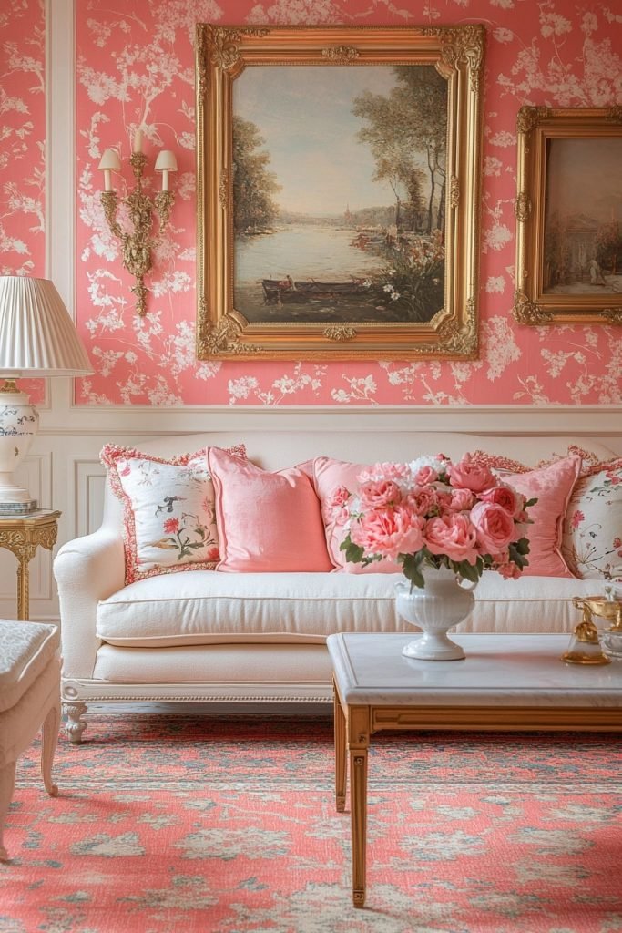
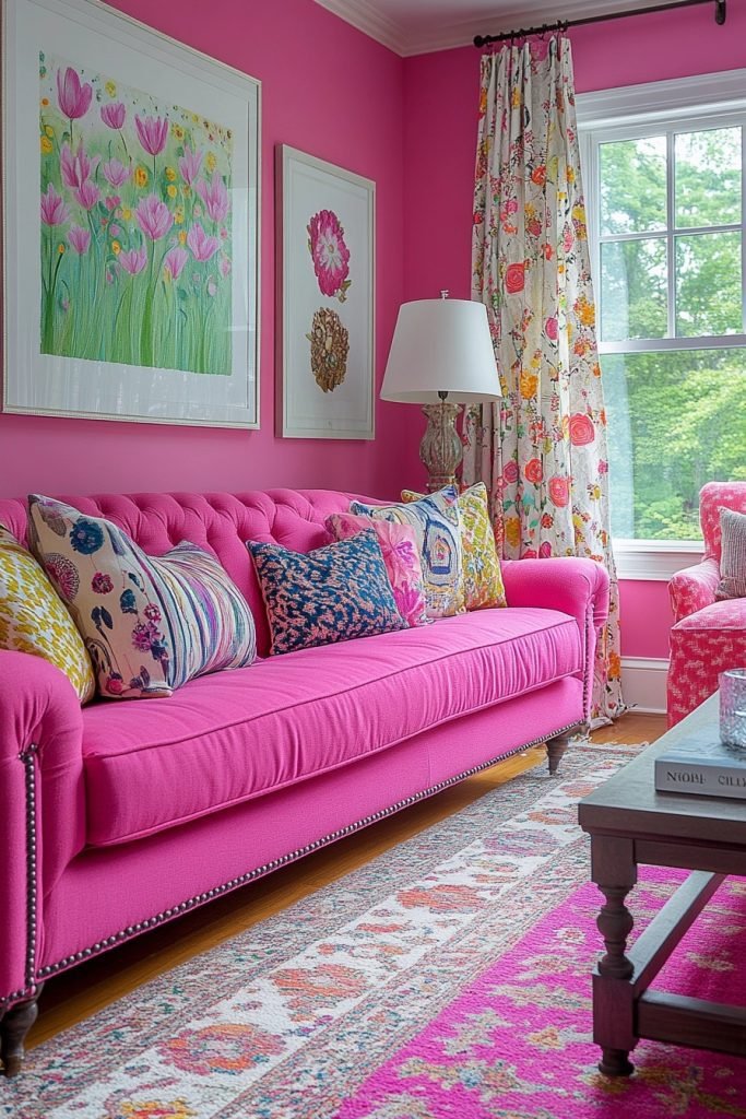
28. Pink Lemonade Living Room
The Pink Lemonade Living Room uses vibrant, refreshing shades of pink reminiscent of pink lemonade, creating a bright and cheerful pink living room. Casual, modern furniture and playful, summery decor make the space fun and inviting. This room is perfect for lively family gatherings or casual hangouts, with a color scheme that energizes and uplifts. Light woods and white accents keep the atmosphere fresh and vibrant.
🖼 Steal This Look
- Paint Color: Clare Paint Rosé Season 0017
- Furniture: low-profile white slipcovered sofa, light oak nesting coffee tables, woven rattan accent chair
- Lighting: natural rattan pendant with exposed bulb, brass floor lamp with linen shade
- Materials: bleached oak, white-washed rattan, crisp cotton canvas, matte ceramic
This shade hits that nostalgic sweet spot—like the best summer afternoons—without tipping into nursery territory when you keep everything else breezy and unfussy.
29. Candied Pink Conversation Space
The Candied Pink Conversation Space is designed around soft, candied pink tones that create a sweet and welcoming atmosphere in a pink living room. The arrangement focuses on comfortable seating and engaging layouts to encourage conversation and interaction. Soft textures, cozy throws, and cushioned seating ensure that guests feel relaxed and at ease. This space is perfect for hosting, with a warm and inviting decor that encourages guests to stay and chat.
★ Steal This Look
- Paint Color: Fine Paints of Europe Hollandlac Brilliant Pink Ground HC-58
- Furniture: curved blush velvet sofa with rounded arms, pair of low-profile blush bouclé swivel chairs, round marble-topped coffee table with brass base
- Lighting: oversized white linen drum pendant with warm brass hardware
- Materials: velvet, bouclé, Carrara marble, brushed brass, chunky knit wool throws
This candied pink reads sugary without being saccharine—it’s the grown-up version of a childhood dream room, and honestly, guests linger longer because the color itself feels like a compliment.
Conclusion
As you’ve seen, incorporating pink into your living room can be both chic and stylish when done with the right touch. These 29 pink living room ideas offer a variety of ways to bring this vibrant color into your space, whether you’re going for a bold statement or a subtle accent. By blending different shades, textures, and design elements, you can create a pink living room that’s uniquely yours—full of charm, elegance, and personality. So go ahead, embrace the pink, and transform your living room into the chic and stylish haven you’ve always dreamed of!