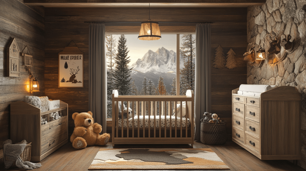
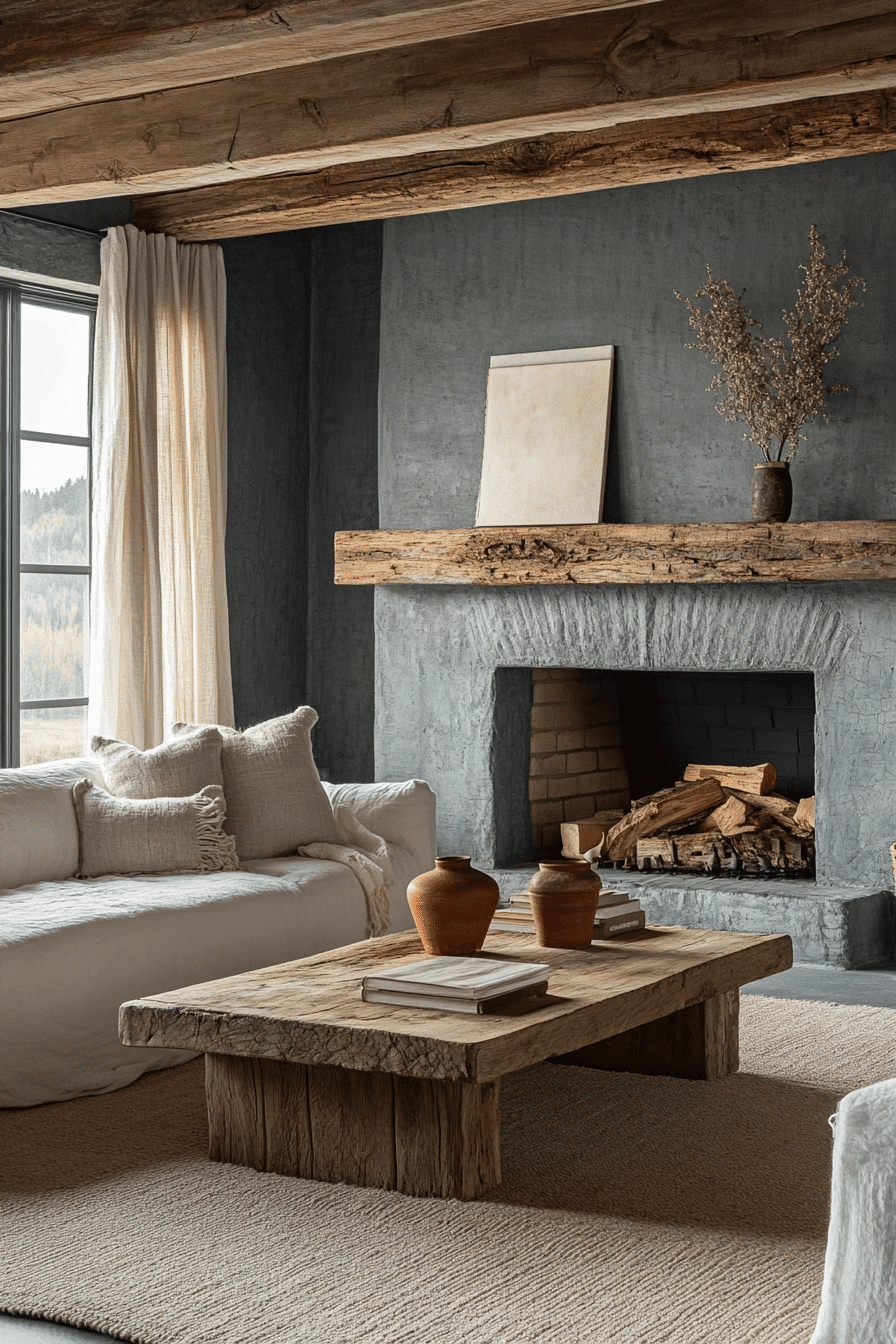
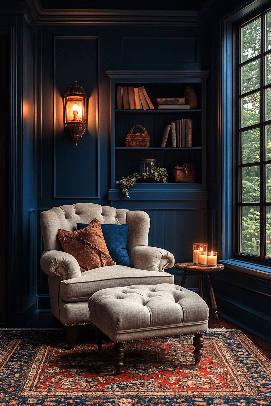
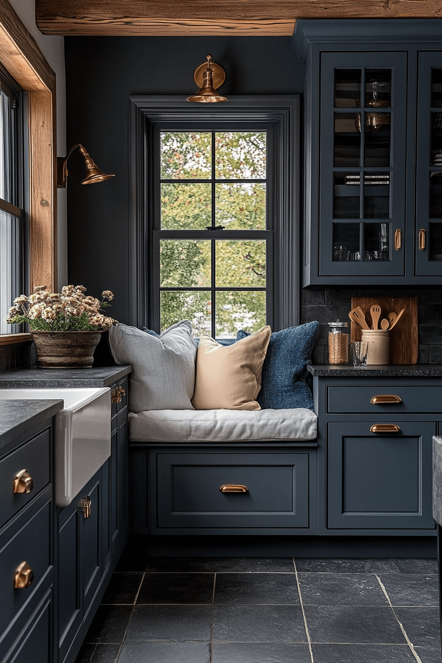
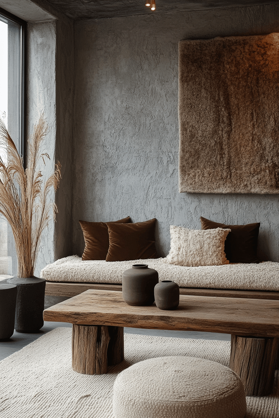
Step into a world where cozy meets mysterious, where shadows dance with warmth, and where your home becomes a dreamy sanctuary of moody elegance! Dark cottagecore is taking the design world by storm, and we’re absolutely obsessed with how it transforms ordinary spaces into enchanting retreats that feel like they’re straight out of a fairy tale. Whether you’re drawn to midnight blues, smoky grays, or rich charcoals, these 29 stunning dark cottagecore room ideas will have you swooning and reaching for your paintbrush faster than you can say “cozy vibes.” Get ready to fall head over heels for these beautifully brooding spaces that prove darkness and comfort go together like candlelight and rainy evenings – it’s time to embrace your moody side and create the atmospheric haven of your dreams!
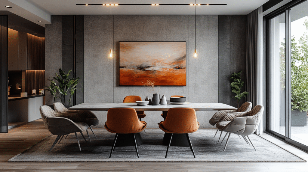
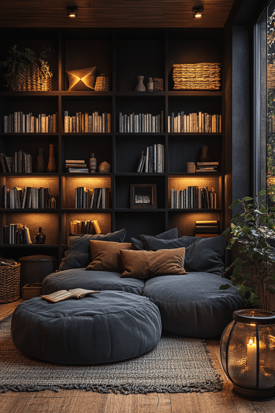
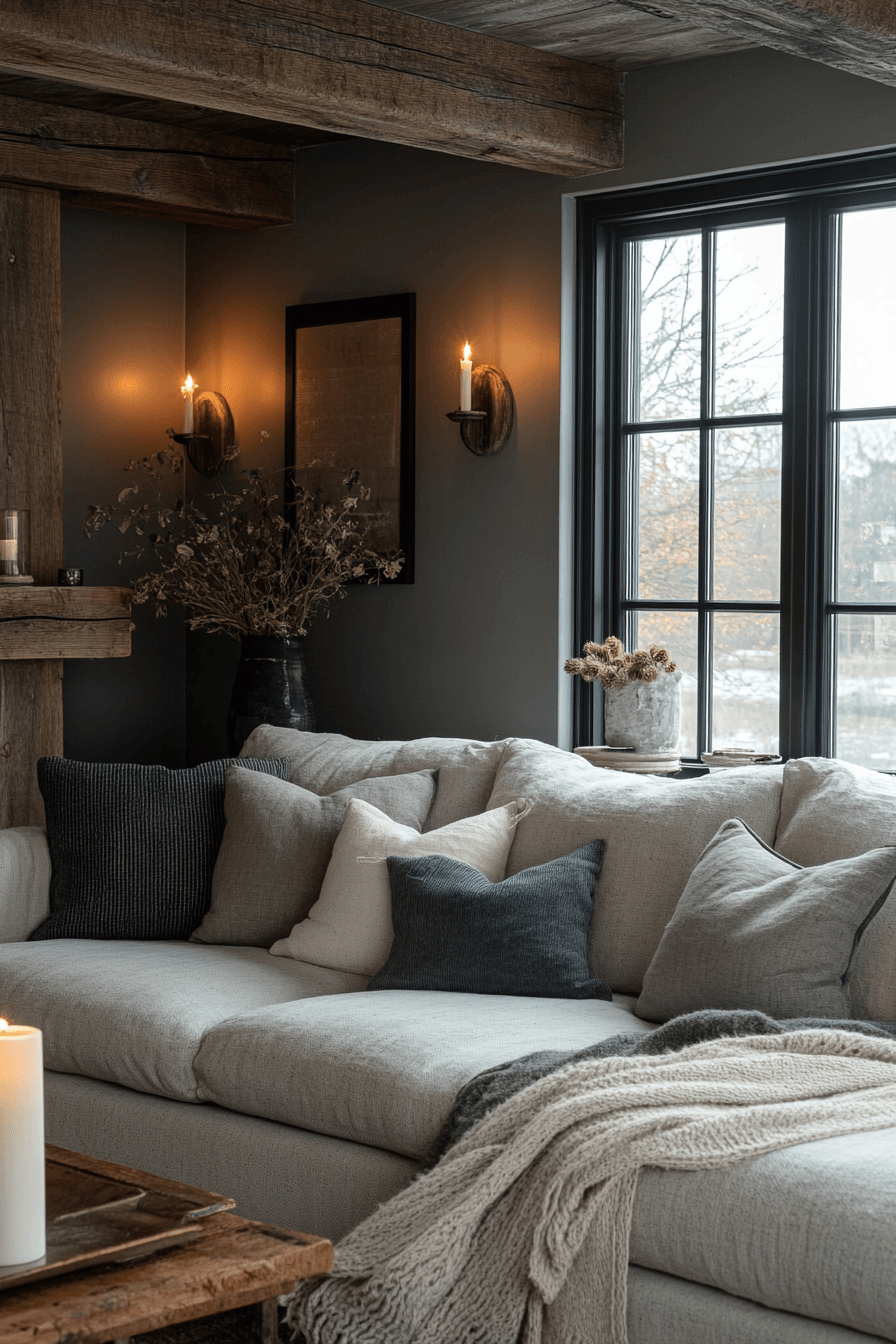
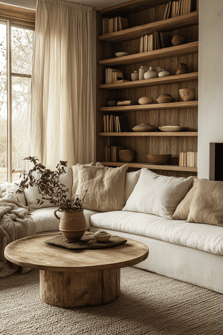
1. Midnight Cottagecore Aesthetic
The Midnight Cottagecore Aesthetic blends deep tones and muted finishes to create an atmosphere that perfectly embodies dark cottagecore design. This theme relies on a rich color palette, soft textures, and thoughtful contrast to evoke comfort and mystery all in one. It works especially well in cozy interiors where the dark cottagecore style adds both drama and warmth without being overwhelming. Layered materials and subdued lighting bring the space to life, enhancing its character and charm.
★ Steal This Look
- Paint Color: Sherwin-Williams Iron Ore SW 7069
- Furniture: weathered wood dining table with turned legs and upholstered chairs in charcoal linen
- Lighting: wrought iron chandelier with candle-style bulbs
- Materials: reclaimed wood, aged brass hardware, linen textiles, stone accents
There’s something magical about spaces that feel like they could exist in a fairy tale’s darker chapters. This aesthetic gives you permission to embrace drama while keeping that cozy, lived-in feeling we all crave.
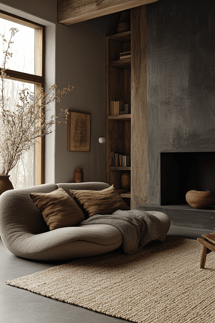
2. Deep Earth Cottagecore Style
The Deep Earth Cottagecore Style uses grounded neutrals and darkened accents to craft a moody yet inviting setting reflective of true dark cottagecore aesthetics. With earth-inspired tones and sturdy materials, the room feels deeply rooted and nurturing. It’s ideal for those seeking a cozy space with a bit of edge. The design embraces subtle contrast, emphasizing texture over brightness.
✎ Steal This Look
- Paint Color: Benjamin Moore Wenge AF-180
- Furniture: reclaimed wood dining table with wrought iron legs and vintage ladder-back chairs
- Lighting: wrought iron chandelier with Edison bulb fixtures
- Materials: rough-hewn wood beams, natural stone accents, and woven jute textiles
Deep earth cottagecore transforms your space into a moody sanctuary that feels like a woodland retreat. The darker palette creates intimacy while natural textures keep it feeling organic and welcoming.
3. Dark Stone Cottagecore Room
The Dark Stone Cottagecore Room makes use of slate, charcoal, and other stone-inspired hues to create a rich, grounded ambiance. It evokes a sense of calm and strength that suits the dark cottagecore aesthetic perfectly. Smooth finishes mixed with weathered tones give it a sense of timelessness. This space offers depth without heaviness.
✎ Steal This Look
- Paint Color: Farrow & Ball Down Pipe No. 26
- Furniture: weathered wood dining table with stone-top accent pieces
- Lighting: wrought iron chandelier with Edison bulbs
- Materials: slate tiles, charcoal linen, weathered wood beams
There’s something deeply satisfying about a space that feels carved from the earth itself. The dark stone palette creates an almost cave-like coziness that makes you want to light candles and settle in for the evening.
✅ Get The Look
4. Moody Cottagecore Palette
The Moody Cottagecore Palette thrives on contrast and softness, combining dark walls with warm lighting and soft furnishings. It captures the emotional richness of the dark cottagecore style. Each design element is chosen for its ability to ground the space while still allowing personality to shine. This style is both cozy and expressive.
🏠 Steal This Look
- Paint Color: Behr Black Forest Green S350-7 for deep, moody walls that capture the dark cottagecore essence
- Furniture: weathered wood dining table with vintage ladder-back chairs and linen cushions
- Lighting: warm brass pendant lights with Edison bulbs and vintage oil lamp-style table lamps
- Materials: reclaimed wood, aged brass, linen fabrics, and natural stone accents
There’s something deeply satisfying about a space that feels like a cozy cabin retreat, where dark walls create an intimate cocoon perfect for quiet evenings. The contrast between moody depths and warm glowing light creates that coveted cottagecore magic.
5. Twilight Cottagecore Mood
The Twilight Cottagecore Mood is inspired by the muted light just after sunset, using cool and dusky tones to set a peaceful ambiance. Its balance of shadows and soft light defines the charm of dark cottagecore. It’s a soothing atmosphere perfect for quiet moments and creative thinking. The materials chosen add warmth even in the darker color scheme.
💡 Steal This Look
- Paint Color: Valspar Dusky Lavender 4004-4B for walls with deep charcoal accent wall in Valspar Noir 6016-1C
- Furniture: vintage wooden chest in weathered oak finish, upholstered reading chair in sage velvet
- Lighting: wrought iron table lamp with warm Edison bulb and linen shade
- Materials: reclaimed wood, worn leather, natural linen, aged brass hardware
There’s something magical about recreating that golden hour feeling indoors when the day winds down. This palette makes every evening feel like a cozy retreat.
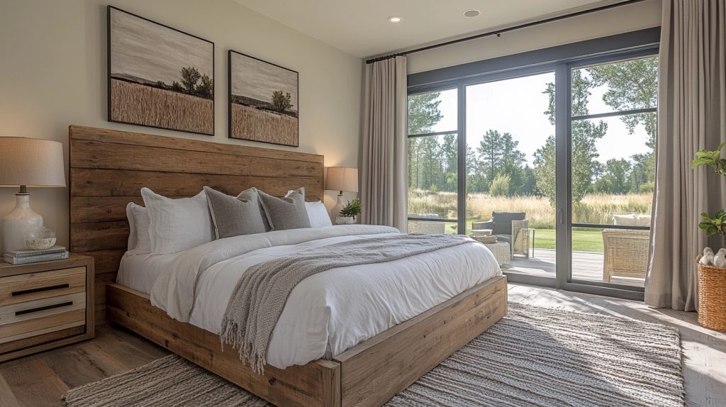
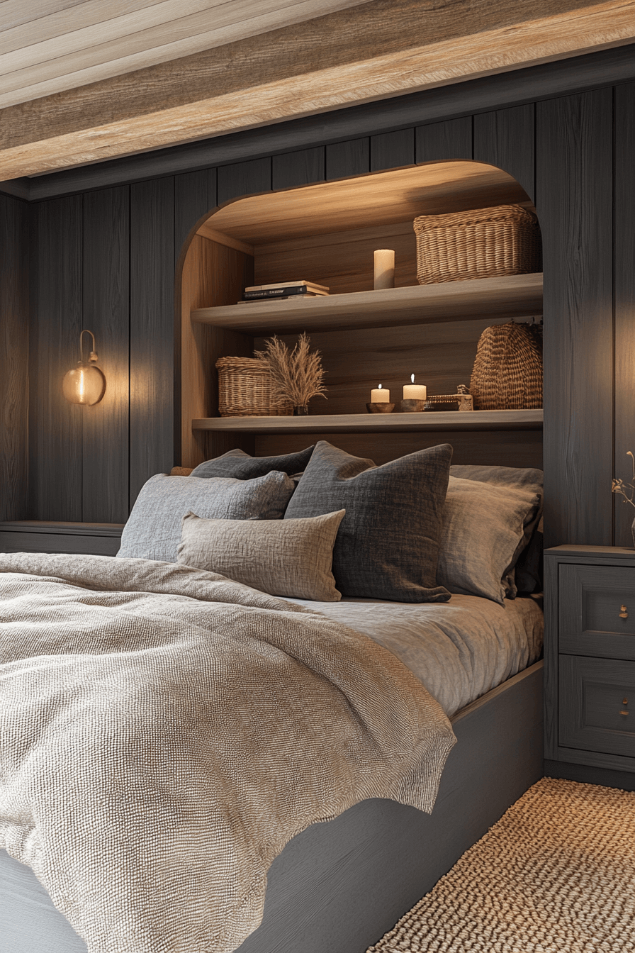
6. Charcoal Cottagecore Retreat
The Charcoal Cottagecore Retreat wraps you in comfort with its dark grey finishes and plush, textured accents. It’s a space where stillness and coziness coexist, deeply aligned with dark cottagecore values. Layers of material bring depth to the room. It feels private and protective, like a quiet escape.
💡 Steal This Look
- Paint Color: PPG Charcoal Slate PPG1010-7
- Furniture: weathered wood four-poster bed with linen upholstered headboard
- Lighting: wrought iron chandelier with Edison bulbs
- Materials: chunky knit throws, raw wood beams, vintage brass accents
There’s something deeply grounding about a bedroom that feels like a cozy cave. This charcoal cottagecore approach creates that perfect balance of rustic charm and modern sophistication that makes you never want to leave.
7. Shadowed Cottagecore Vibe
The Shadowed Cottagecore Vibe emphasizes moody corners, quiet tones, and simple forms to achieve a hushed elegance. It’s a refined take on dark cottagecore that uses restraint rather than boldness. Subtle patterns and finishes give it dimension. The atmosphere encourages slow living and deep thought.
✎ Steal This Look
- Paint Color: Dunn-Edwards Charcoal Sketch DE6385 for accent walls with Dunn-Edwards Studio White DEW340 for remaining walls
- Furniture: Weathered oak dining table with turned legs, linen-upholstered chairs in charcoal, vintage wooden hutch with glass doors
- Lighting: Wrought iron chandelier with candle-style bulbs, brass table lamps with linen shades
- Materials: Weathered wood, natural linen, aged brass hardware, matte black iron
This look is perfect for those who crave the romance of cottagecore but prefer sophisticated restraint over abundance. It’s cottagecore for the introspective soul.
8. Smoky Cottagecore Ambiance
The Smoky Cottagecore Ambiance uses misty greys and cool neutrals to create a calming, dreamlike feel. It perfectly expresses the darker side of cottagecore through atmosphere rather than accessories. Balanced lighting and smooth textures bring out the softness in the palette. This is a design for daydreamers and minimalists alike.
★ Steal This Look
- Paint Color: Clare Paint Current Mood CC-15
- Furniture: linen upholstered armchair in dove grey with weathered oak frame
- Lighting: frosted glass pendant with warm LED bulbs for diffused glow
- Materials: brushed wool throws, smooth ceramic vessels, and aged wood accents
There’s something magical about a room that feels like you’re living inside a soft morning fog. This smoky approach to cottagecore trades busy florals for pure, calming atmosphere.
9. Noir Cottagecore Interior

The Noir Cottagecore Interior plays with the boldness of black and dark hues to bring out subtle romance and comfort. Everything feels intentional, from the matte finishes to the gentle lighting. It’s moody but never cold, perfect for the introspective soul. Contrast comes through softness, not shine.
💡 Steal This Look
- Paint Color: Fine Paints of Europe Lamp Black HC-201
- Furniture: matte black iron bed frame with linen bedding in cream and charcoal
- Lighting: wrought iron candelabra with pillar candles
- Materials: matte black metal, raw linen, weathered wood, stone
There’s something deeply romantic about embracing darkness in your sanctuary. This look speaks to those who find beauty in stormy skies and candlelit evenings.
10. Forest Fog Cottagecore

The Forest Fog Cottagecore design leans into foggy greys and washed cool tones to create an ethereal, grounded space. While the palette is desaturated, it still brings richness and calm. This dark cottagecore room is soft-spoken yet incredibly expressive. It’s a space that feels both otherworldly and safe.
🖼 Steal This Look
- Paint Color: Backdrop Fog BG-23
- Furniture: weathered wood dining table with mismatched vintage chairs in muted tones
- Lighting: wrought iron chandelier with candle-style bulbs
- Materials: linen curtains, raw wood beams, stone accents
There’s something magical about spaces that feel like they exist between worlds, where the boundary between indoors and the misty forest outside becomes beautifully blurred. This ethereal cottagecore style creates a cocoon of calm that still feels deeply connected to nature.
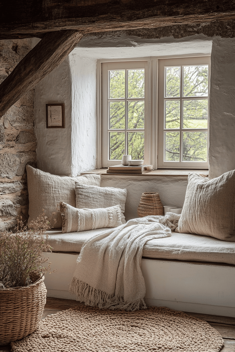
11. Ash Gray Cottagecore Design
The Ash Gray Cottagecore Design features neutral greys that read cool and comforting, with a smoky softness that defines dark cottagecore. Every choice in texture and material enhances the room’s sense of peace. Clean lines are softened by warm lighting and quiet details. This setup is perfect for modern spaces wanting a grounded twist.
🎨 Steal This Look
- Paint Color: Sherwin-Williams Cityscape SW 7067
- Furniture: reclaimed wood dining table with linen upholstered chairs in natural tones
- Lighting: wrought iron pendant with Edison bulb filaments
- Materials: rough-hewn wood beams, linen textiles, and weathered metal accents
There’s something deeply calming about ash gray’s ability to feel both modern and timeless. This palette creates that perfect cocoon feeling where you can truly unwind.
👑 Get The Look
12. Overcast Cottagecore Space

The Overcast Cottagecore Space draws from cloudy skies and quiet mornings, using dulled blues and warm greys to create a restful atmosphere. It’s beautifully simple yet thoughtful in every aspect. The space feels suspended in time, quiet and introspective. Perfect for cozy afternoons and calm routines.
🎨 Steal This Look
- Paint Color: Benjamin Moore Cloudy Sky 2131-60 for main walls with Storm Cloud Gray 2140-40 accent wall
- Furniture: weathered wood dining table with mismatched vintage chairs in soft blue and cream painted finishes
- Lighting: wrought iron chandelier with Edison bulbs and white linen lampshades on side tables
- Materials: reclaimed barnwood, aged brass hardware, chunky knit textiles, and natural linen fabrics
There’s something deeply comforting about spaces that embrace grey skies rather than fight them. This overcast cottagecore look captures those peaceful, introspective moments when the world feels hushed and gentle.
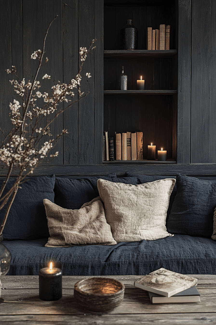
13. Inkwell Cottagecore Look
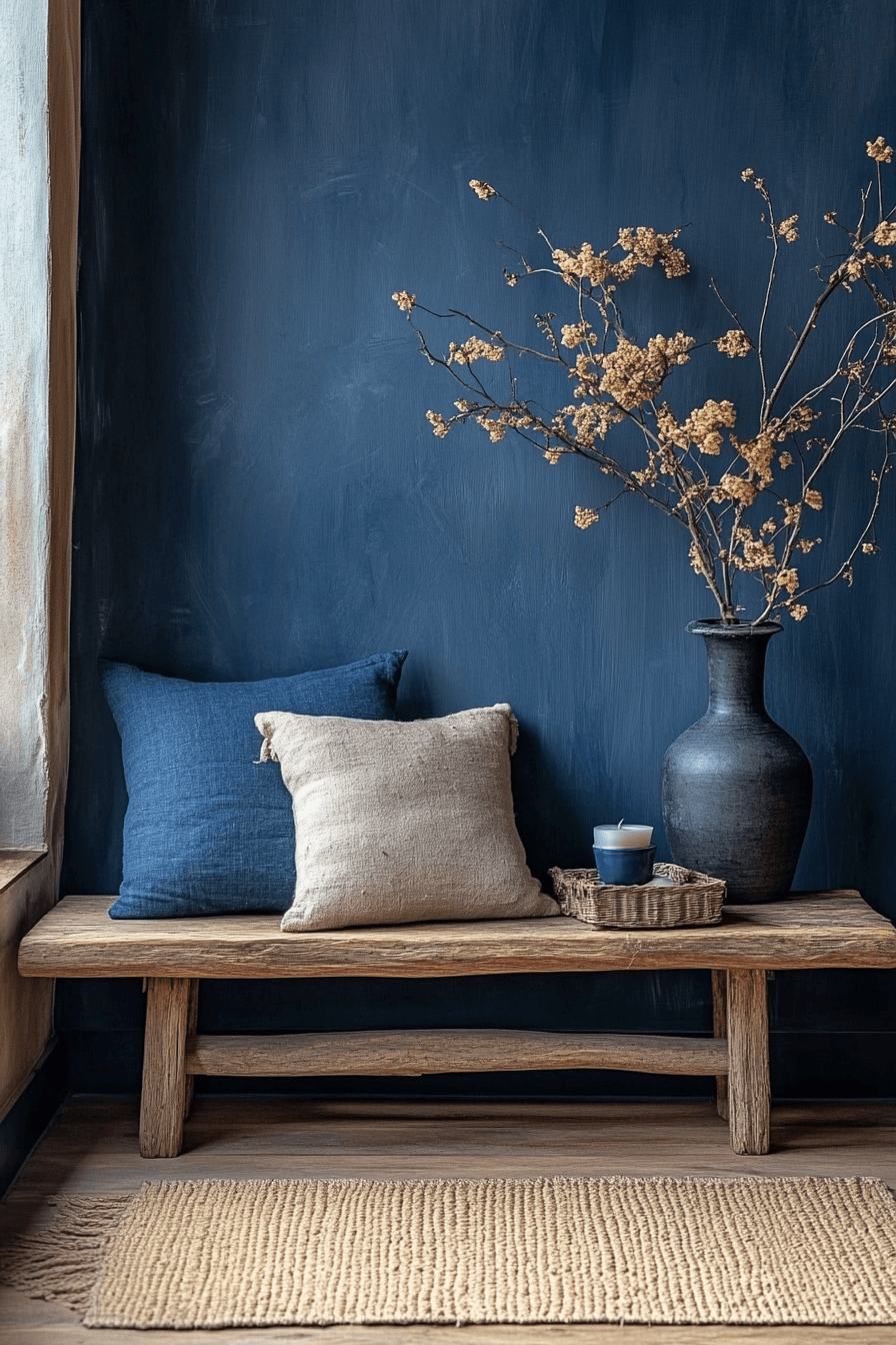
The Inkwell Cottagecore Look features deep navy and ink tones that carry weight and presence. These colors envelop the space in a sense of serenity and mystery. The dark cottagecore design is elevated by soft fabrics and gentle light. It’s bold in tone but soft in mood.
🎨 Steal This Look
- Paint Color: Farrow & Ball Hague Blue No. 30
- Furniture: vintage oak writing desk with turned legs and linen-upholstered wingback chair
- Lighting: brass table lamp with cream linen shade
- Materials: aged brass hardware, chunky knit throws, and weathered wood finishes
There’s something incredibly romantic about a room wrapped in deep ink tones – it feels like you’re writing poetry by candlelight. The key is layering in enough soft textures and warm metallics to keep it feeling inviting rather than somber.
🌊 Get The Look
14. Stormy Cottagecore Aesthetic
The Stormy Cottagecore Aesthetic embraces dramatic tones like slate, dusk blue, and charcoal to mimic the energy of a coming storm. This look adds energy and emotion to the cottagecore foundation. Lighting plays a key role in balancing the power of the palette. It’s strong, expressive, and beautifully moody.
🎨 Steal This Look
- Paint Color: Behr Slate Blue S470-6
- Furniture: weathered wood dining table with wrought iron details
- Lighting: vintage lantern-style pendant with Edison bulbs
- Materials: rough-hewn wood, aged metal, linen textures
There’s something deeply romantic about embracing the drama of an approaching storm in your decor. This aesthetic lets you create a space that feels both cozy and powerfully atmospheric.
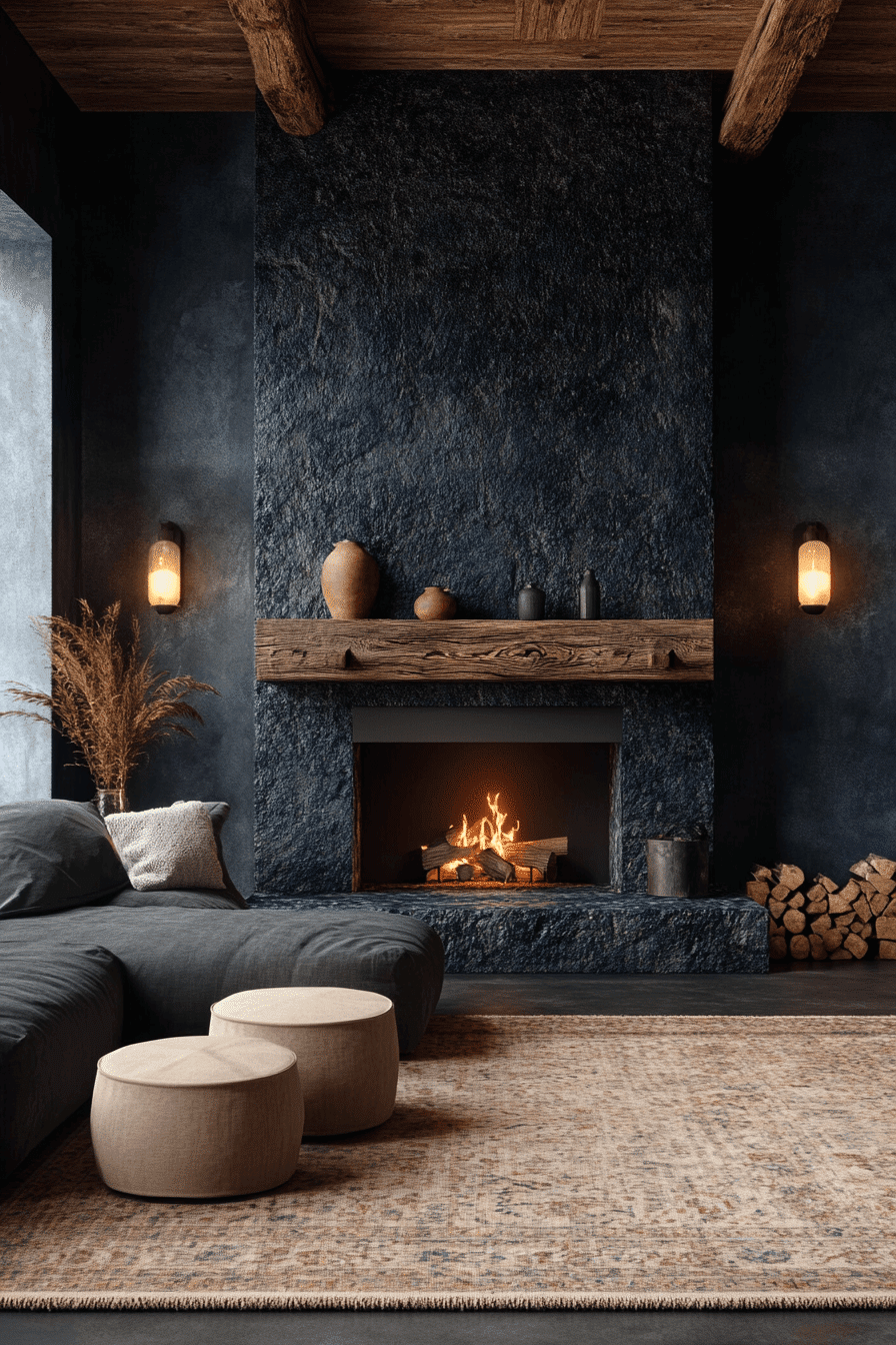
15. Coal-Toned Cottagecore Setup
The Coal-Toned Cottagecore Setup draws from blackened charcoal and matte textures to create a dramatic but inviting room. Even with its dark palette, the space feels welcoming. The use of low lighting and natural materials softens the look. It’s strong yet still carries the charm of cottagecore.
🎨 Steal This Look
- Paint Color: Valspar Charcoal Slate 5008-10A for dramatic accent walls with matte finish to enhance the coal-toned aesthetic
- Furniture: weathered wood dining table with black metal accents and vintage upholstered chairs in charcoal linen
- Lighting: wrought iron chandelier with Edison bulb fixtures for authentic low lighting ambiance
- Materials: matte black metal hardware, rough-hewn wood beams, charcoal linen textiles, and natural stone accents
There’s something beautifully rebellious about dark cottagecore – it takes the genre’s romantic charm and gives it an edge. The coal tones create intimacy while natural materials keep it from feeling too gothic.
16. Misty Moors Cottagecore Room
The Misty Moors Cottagecore Room uses grey-blues and misty taupes to evoke the feeling of a fog-covered hillside. It’s a space filled with quiet elegance and muted emotion. The dark cottagecore appeal is present in the layered textures and mood-setting finishes. The look is calm, contemplative, and poetic.
🏠 Steal This Look
- Paint Color: PPG Storm Cloud PPG1164-6
- Furniture: weathered oak farmhouse dining table with distressed finish
- Lighting: wrought iron chandelier with Edison bulbs
- Materials: raw linen, aged brass, reclaimed wood, natural stone
This palette captures that haunting beauty of English moors on a misty morning. The muted tones create a space that feels both grounding and dreamlike.
17. Raven Blue Cottagecore Style
The Raven Blue Cottagecore Style uses almost-black blues to create a dramatic contrast in a peaceful interior. Accents in light neutrals add visual clarity without breaking the mood. The look is luxurious yet grounded, like a moonlit sky. It brings elegance to the dark cottagecore trend.
✎ Steal This Look
- Paint Color: Dunn-Edwards Raven Black DE6350 for accent walls with Dunn-Edwards Whisper DE6365 for remaining walls
- Furniture: weathered wood dining table with linen-upholstered chairs in cream, vintage dark wood bookshelf with carved details
- Lighting: wrought iron chandelier with Edison bulbs and cream fabric lampshades
- Materials: rough-hewn dark wood beams, linen textiles in cream and ivory, aged brass hardware
There’s something utterly romantic about a room wrapped in deep, moody blue that feels like being embraced by twilight. This color palette brings sophisticated drama while maintaining that cozy cottage charm we all crave.
18. Dusty Shadows Cottagecore

The Dusty Shadows Cottagecore look embraces subtlety and shadow, with soft greys, faded blacks, and a touch of cool taupe. It’s built for moments of reflection and relaxation. This dark cottagecore space favors layers and texture over sharp contrast. Everything feels gentle yet purposeful.
🌟 Steal This Look
- Paint Color: Clare Paint Current Mood C10 for main walls with deeper charcoal accent wall in Clare Paint Blackest C61
- Furniture: weathered wood dining table with vintage spindle chairs and distressed metal accents
- Lighting: wrought iron chandelier with Edison bulbs and ambient table lamps with linen shades
- Materials: layered linen textiles, weathered wood, aged metal, and soft wool throws
This shadowy cottagecore aesthetic creates the perfect retreat for quiet mornings with tea and contemplation. The beauty lies in the subtle interplay of soft greys and gentle textures.
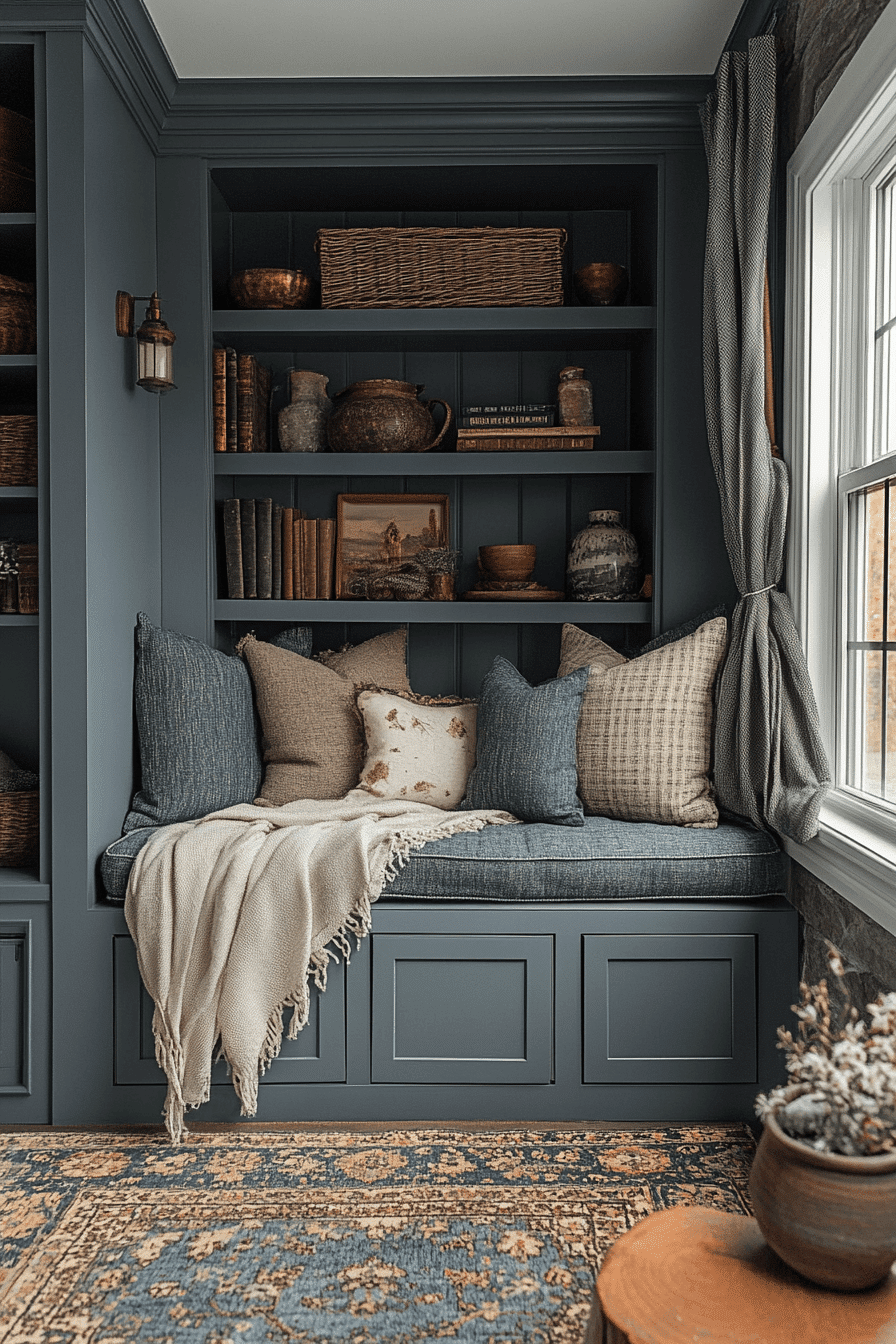
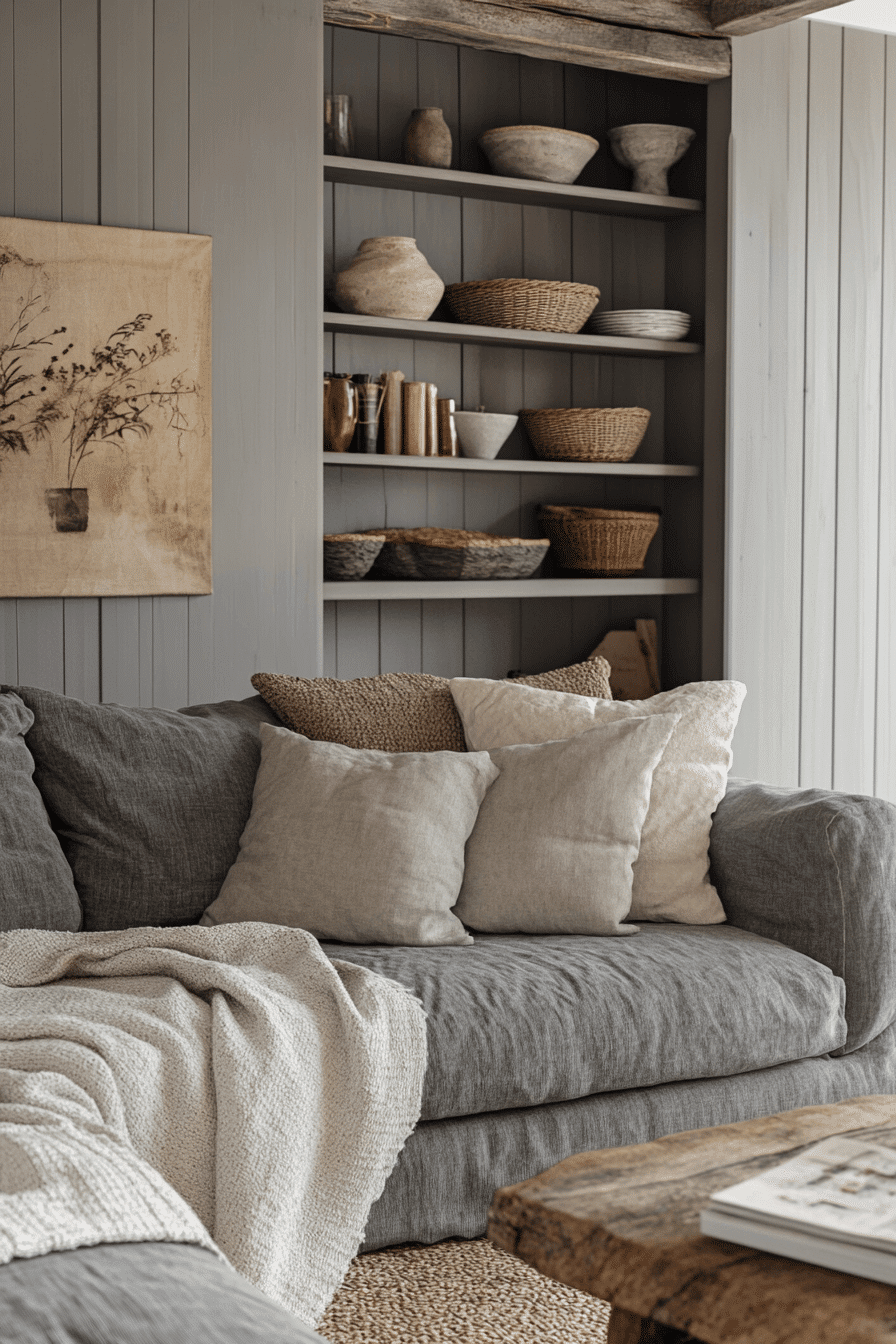
19. Cool Slate Cottagecore Interior
The Cool Slate Cottagecore Interior uses blue-gray undertones and structured shapes to create a composed and balanced mood. The finishes are soft but rich in tone, perfect for quiet elegance. The room feels grounded, like stone underfoot. This is a refined take on dark cottagecore, made for modern settings.
🎨 Steal This Look
- Paint Color: Fine Paints of Europe Slate Blue HC-162
- Furniture: structured wooden furniture with clean lines in weathered oak finish
- Lighting: wrought iron pendant with linen drum shade
- Materials: natural stone, linen textures, brushed steel accents
There’s something incredibly soothing about slate tones that feels both modern and timeless. This palette creates a sanctuary that’s sophisticated enough for entertaining yet comfortable for everyday living.
20. Moonlit Cottagecore Escape
The Moonlit Cottagecore Escape captures the feeling of nighttime light bouncing off stone and wood. It’s mysterious but peaceful, relying on soft edges and low contrast. The colors are cool, but the atmosphere is warm. It offers the perfect hideaway for dark cottagecore lovers.
✎ Steal This Look
- Paint Color: Backdrop Nightfall N40 for deep moody walls that capture moonlit stone atmosphere
- Furniture: weathered wood dining table with curved edges and vintage wooden chairs with worn finishes
- Lighting: wrought iron chandelier with dimmer switch and flickering candle-style bulbs
- Materials: rough-hewn stone accents, aged wood beams, soft linen textiles, and antique brass hardware
There’s something deeply romantic about a space that feels like an old cottage bathed in moonlight. This look transforms any dining room into a place where every meal feels like a candlelit escape.
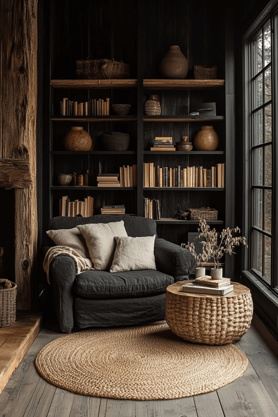
21. Shaded Stone Cottagecore

The Shaded Stone Cottagecore design focuses on mineral tones and polished surfaces to express dark beauty. It’s minimalist yet intimate, with intentional contrast. The look is clean, quiet, and strong. This is cottagecore with a polished edge.
💡 Steal This Look
- Paint Color: Sherwin-Williams Cavern Clay SW 7701
- Furniture: weathered stone dining table with sleek metal legs
- Lighting: matte black pendant light with warm Edison bulb
- Materials: polished concrete, brushed steel, raw linen
This is cottagecore for the modern purist—all the warmth of countryside living but edited down to its most essential, beautiful elements. It’s farmhouse charm that doesn’t apologize for loving clean design.
22. Fogbound Cottagecore Feel
The Fogbound Cottagecore Feel surrounds you with muted tones and a sense of quiet mystery. Everything about this space is intentional and soft-spoken. Texture takes the spotlight over bold color. It’s a restful, moody haven for slow living.
🖼 Steal This Look
- Paint Color: Benjamin Moore Stonington Gray HC-170
- Furniture: weathered wood dining table with turned legs and linen-upholstered chairs
- Lighting: vintage brass pendant with frosted glass shade
- Materials: raw linen, aged wood, brushed brass, natural stone
There’s something deeply calming about a space that whispers rather than shouts. This fogbound aesthetic creates the perfect backdrop for slow mornings and thoughtful evenings.
✓ Get The Look
23. Deep Charcoal Cottagecore Scheme

The Deep Charcoal Cottagecore Scheme brings weight and depth to a room through blackened greys and layered tones. The textures are smooth yet rustic, and the lighting stays warm. It’s a grounded, dramatic setting that invites contemplation. The space feels calm but full of character.
💡 Steal This Look
- Paint Color: Farrow & Ball Railings No. 31
- Furniture: vintage wooden dining table with weathered finish and rush-seat chairs
- Lighting: wrought iron chandelier with warm Edison bulbs
- Materials: rough-hewn wood beams, linen textiles, and aged brass accents
This moody cottagecore approach proves that romantic country style doesn’t have to be all pastels and florals. The deep charcoal creates an intimate cocoon perfect for cozy evening gatherings.
24. Granite Hue Cottagecore
The Granite Hue Cottagecore look is defined by cool greys and strong neutrals, making it feel both ancient and new. It brings clarity through structure, and comfort through material. A quiet luxury flows through every corner. Perfect for a subtle yet striking atmosphere.
💡 Steal This Look
- Paint Color: Behr Granite Boulder PPU18-02
- Furniture: weathered wood dining table with iron metal legs
- Lighting: wrought iron chandelier with Edison bulbs
- Materials: natural stone, aged wood, linen textiles
There’s something deeply grounding about a space that mirrors the steadfast beauty of stone. This palette creates a sanctuary that feels both timeless and effortlessly sophisticated.
25. Overcast Sky Cottagecore
The Overcast Sky Cottagecore setting features bluish greys and soft whites to emulate the calm before a storm. It’s designed for introspection and quiet daily rituals. The palette is simple but the mood is rich. Ideal for peaceful solitude.
🖼 Steal This Look
- Paint Color: Valspar Storm Cloud 5004-4A for accent walls with Valspar Dove White 7006-16 for main walls to capture the overcast sky mood
- Furniture: weathered wood farmhouse table with linen-upholstered chairs in soft grey tones
- Lighting: wrought iron pendant with Edison bulbs for moody ambient lighting
- Materials: reclaimed wood, linen textiles, aged metal accents, and stone elements
There’s something deeply comforting about embracing the quiet beauty of grey days. This palette turns your space into a sanctuary for reflection and slow living moments.
26. Clouded Cottagecore Vibe
The Clouded Cottagecore Vibe creates a soft, layered look using misty tones and delicate finishes. Nothing is too bright or bold, yet the space carries depth. Light materials and a grounded palette bring balance. A perfect choice for cozy, quiet spaces.
✎ Steal This Look
- Paint Color: PPG Clouded Sky PPG1040-3 – a soft gray-blue that captures the misty, ethereal quality of clouded skies
- Furniture: weathered wood dining table with linen upholstered chairs and vintage botanical prints
- Lighting: vintage brass pendant with frosted glass shade for diffused illumination
- Materials: linen fabrics, weathered wood, matte ceramics, and natural stone accents
There’s something magical about spaces that feel like they’re wrapped in morning mist – soft, quiet, and endlessly comforting. This clouded approach to cottagecore brings that same gentle embrace indoors.
27. Dusk Gray Cottagecore Look
The Dusk Gray Cottagecore Look features silvery greys with matte finishes, offering calm and refinement. The space is elegantly reserved, never loud. Lighting highlights softness instead of shine. Perfect for tranquil living.
🏠 Steal This Look
- Paint Color: Dunn-Edwards Silver Strand DE6317
- Furniture: weathered wood dining table with linen upholstered chairs
- Lighting: matte black pendant with frosted glass shade
- Materials: raw linen, weathered oak, brushed pewter hardware
There’s something deeply calming about a space that whispers rather than shouts. This silvery gray palette creates the perfect backdrop for slow living and mindful moments.
28. Murky Tones Cottagecore

The Murky Tones Cottagecore design leans into muted contrast, with washed greys and faded browns blending seamlessly. It’s moody and mellow without feeling heavy. This look brings subtle intrigue to a space. Ideal for those who value quiet comfort.
🖼 Steal This Look
- Paint Color: Clare Paint Current Mood (a muted charcoal grey) for accent walls, paired with Clare Paint Whipped (warm off-white) for balance
- Furniture: weathered wood dining table, linen-upholstered chairs in mushroom tones, vintage hutch with distressed finish
- Lighting: wrought iron chandelier with Edison bulbs, ceramic table lamps with linen shades
- Materials: aged wood, natural linen, worn leather, brushed metals, stone accents
There’s something deeply comforting about a space that whispers rather than shouts. This murky cottagecore palette creates the perfect backdrop for quiet mornings and contemplative evenings.
29. Winter Sky Cottagecore Mood
The Winter Sky Cottagecore Mood draws from pale greys and icy tones to form a soft yet powerful room atmosphere. It feels peaceful, spacious, and clean. The palette is crisp but not cold. A unique take on dark cottagecore with a serene edge.
Dark cottagecore ideas show that moody tones and rustic charm can come together to create a space that feels both cozy and joyful. With rich colors, vintage details, and natural textures, this style turns everyday living into something magical and comforting. The best part is how easy it is to bring this look to life with affordable accents and personal touches. Start exploring your favorite dark cottagecore ideas today and enjoy a home that feels enchanting, warm, and filled with happiness!
★ Steal This Look
- Paint Color: Fine Paints of Europe Dove Grey HC-83
- Furniture: vintage white-washed wooden bed frame with weathered finish
- Lighting: wrought iron chandelier with crystal accents
- Materials: linen bedding, vintage lace curtains, reclaimed wood nightstands
This winter sky palette brings that magical feeling of a snow-covered cottage morning into your bedroom. The soft greys feel like peaceful winter clouds while vintage textures keep it warm and inviting.