Have you ever thought that mixing colors in your bedroom could be more of an art than a science? What if the perfect combination of hues could completely transform the vibe of your room, turning it into a vibrant, yet relaxing retreat? A Boho Bedroom Color Palette can be your secret weapon for creating a space that’s as lively and unique as you are, without feeling overwhelming. In this article, we’ll explore 29 Boho Bedroom Color Palette Ideas that will help you bring the perfect mix of colors to your space, balancing warmth, style, and serenity. Ready to find your perfect color match? Let’s dive in!
1. Sunset Serenity

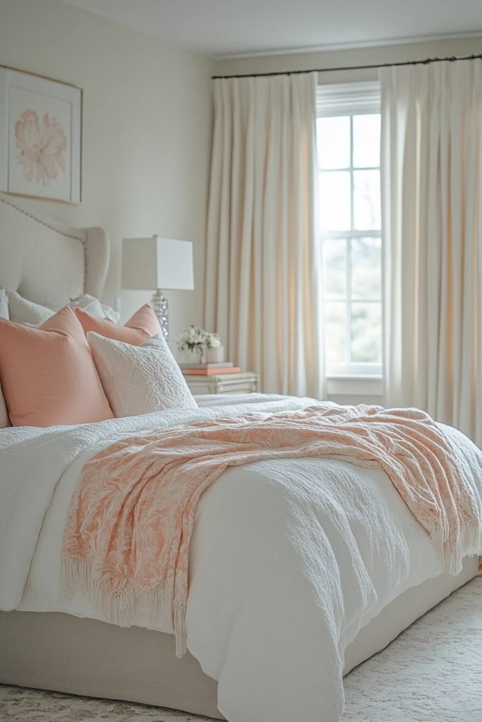
The Sunset Serenity palette features warm oranges and pinks that capture the peaceful essence of a sunset in a boho bedroom. These colors are ideal for creating a soothing atmosphere that encourages relaxation and reflection. By integrating soft textures like velvet or silk in these hues, the bedroom becomes a serene escape. Accents in gold or copper can enhance the warmth of the palette, adding a touch of luxury.
🖼 Steal This Look
- Paint Color: Sherwin-Williams Coral Clay SW 9005
- Furniture: low-profile platform bed with woven rattan headboard, vintage wooden nightstands with carved details
- Lighting: macramé pendant light with warm Edison bulb, brass swing-arm wall sconces
- Materials: velvet throw pillows in terracotta and dusty rose, silk curtains, jute area rug, copper accent mirrors, handwoven wall tapestries
This palette feels like waking up inside a golden hour photograph—there’s something deeply restorative about surrounding yourself with colors that mimic nature’s most peaceful moment.
2. Oceanic Bliss
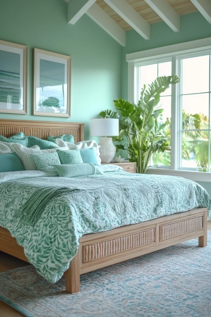
Oceanic Bliss uses deep blues and soft greens to evoke the calming vibes of the ocean in a boho bedroom setting. This palette is perfect for crafting a space that feels both refreshing and relaxing. The use of natural materials like linen and distressed wood complements the aquatic hues, reinforcing the connection to nature. For a serene and inviting atmosphere, incorporate flowing fabrics and wave-like patterns.
💡 Steal This Look
- Paint Color: Benjamin Moore Deep Ocean 2058-30
- Furniture: low-profile platform bed in whitewashed mango wood, rattan peacock chair, driftwood nightstand
- Lighting: oversized woven rattan pendant with soft ambient glow
- Materials: linen bedding in seafoam green, chunky hand-knit cotton throws, seagrass baskets, weathered reclaimed wood accents
This palette feels like waking up in a beach house where the tide just rolled out—there’s something about that deep blue enveloping you that actually slows your breathing.
3. Earthy Haven
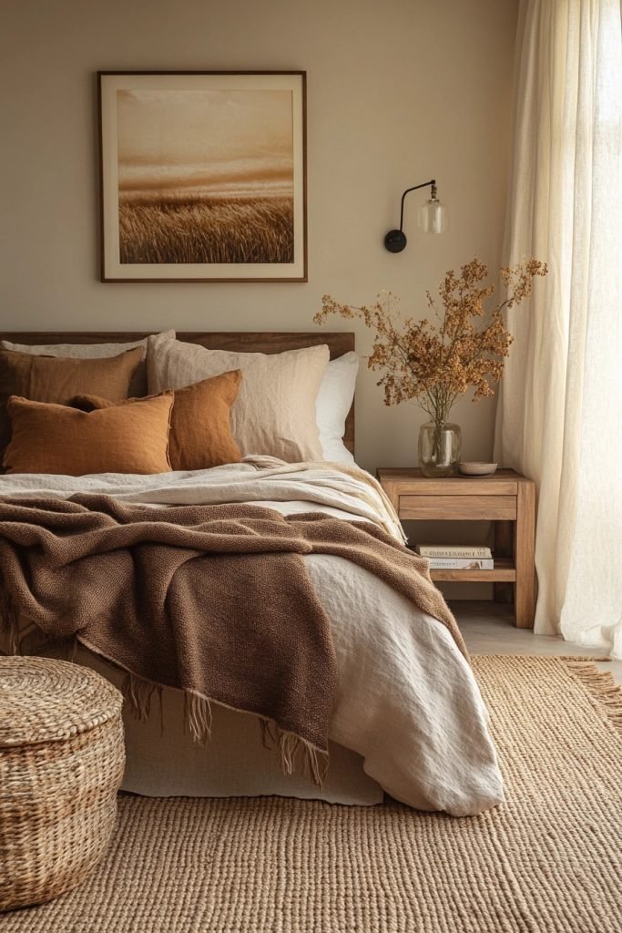
Earthy Haven focuses on rich browns and beiges, grounding the boho bedroom with a sense of stability and warmth. This color scheme is ideal for those who want to create a cozy, nurturing environment. Combining these earth tones with chunky knits and rustic wood enhances the natural feel. Subtle green accents can suggest life and growth without the need for actual plants.
✎ Steal This Look
- Paint Color: Farrow & Ball London Stone 6
- Furniture: low-profile platform bed in reclaimed oak, vintage rattan peacock chair, woven seagrass storage bench at foot of bed
- Lighting: oversized linen drum pendant with warm Edison bulb, brass swing-arm wall sconces with fabric shades
- Materials: chunky hand-knitted wool throws, raw-edge walnut nightstands, terracotta pottery, unbleached cotton macramé
This is the bedroom equivalent of a long exhale—I’ve always found that grounding a space in browns and beiges actually helps quiet the mind before sleep.
4. Midnight Calm
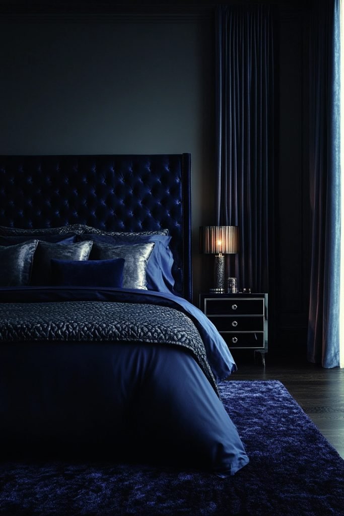
Midnight Calm brings navy and moonlight gray together for a boho bedroom that mirrors the tranquil ambiance of a starlit night. This palette is perfect for creating a sophisticated yet calming space. To add depth, incorporate silver or pale blue accents that shimmer like stars. Plush textiles and reflective surfaces will enhance the serene and mysterious quality of the colors.
🖼 Steal This Look
- Paint Color: Behr Starless Night S-H-790
- Furniture: low-profile platform bed with woven rattan headboard, vintage carved wood nightstands
- Lighting: moon-shaped pendant light with soft glow, string lights draped behind sheer canopy
- Materials: velvet cushions in deep navy, hammered silver mirrors, chunky knit throws, macramé wall hangings
There’s something deeply restorative about falling asleep in a room that feels like 2 AM stargazing—this palette bottles that hush.
5. Sahara Dreams
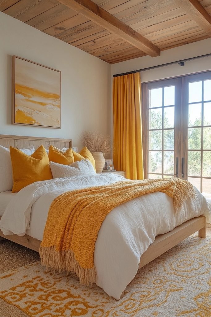
Sahara Dreams combines golden yellows and sand tones to recreate the warmth and expansiveness of the desert in a boho bedroom. This palette is great for those looking to create a bright and airy space. Textures like woven rugs and sheer fabrics can add to the desert vibe, while earthy accessories like terracotta pots provide contrast. Use this palette to inspire creativity and warmth in your space.
★ Steal This Look
- Paint Color: Valspar Golden Apricot 3003-2B
- Furniture: low-profile rattan platform bed with natural cane headboard, carved wood nightstands with brass pulls
- Lighting: oversized woven rattan pendant with warm Edison bulb, brass arc floor lamp with linen shade
- Materials: jute and sisal woven rugs, sheer linen curtains in sand, terracotta and unglazed clay vessels, raw wood accents, macramé wall hangings
This palette feels like waking up in a Joshua Tree casita—the golden walls practically glow at sunset, and every texture invites you to slow down and breathe.
6. Tropical Escape
Tropical Escape utilizes bright teals and aqua to infuse a boho bedroom with the vibrant energy of tropical waters. This color palette can transform a bedroom into a cheerful and invigorating retreat. Pair these vivid colors with white or light wood furniture to maintain a light, beachy feel. Decorative elements like coral prints or bamboo frames can enhance the tropical atmosphere.
🏠 Steal This Look
- Paint Color: PPG Caribbean Splash 2047-40
- Furniture: white platform bed with natural rattan headboard, light oak nightstands
- Lighting: woven bamboo pendant with warm Edison bulb
- Materials: natural rattan, bleached wood, jute, linen, coral-inspired ceramics
This palette hits that sweet spot between energetic and relaxing—like waking up in a beach bungalow where the ocean is your only alarm clock.
7. Soft Harmony
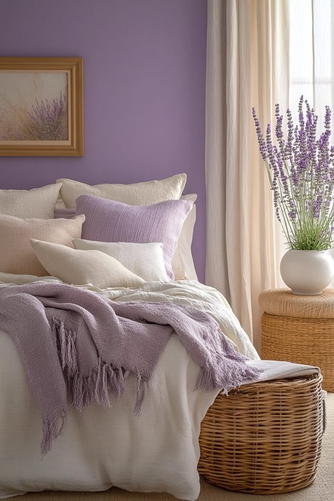
Soft Harmony blends muted lavenders and creams to craft a gentle and calming boho bedroom. This palette is ideal for achieving a soft, romantic vibe without overwhelming the senses. Using varied textures in similar soft tones adds interest and depth to the room while keeping the overall feel harmonious and soothing. Accents in slightly darker shades of purple can add a subtle contrast.
★ Steal This Look
- Paint Color: Dunn-Edwards Lavender Whisper DET431
- Furniture: whitewashed rattan headboard, cream linen upholstered bench, vintage-inspired nightstand with carved details
- Lighting: macramé pendant shade with warm Edison bulb, brass swing-arm wall sconce
- Materials: chunky knit throws, velvet accent pillows in dusty plum, raw cotton curtains, natural jute rug
This is the bedroom you crawl into after a long day when you need the world to feel quieter—it’s romantic without trying too hard, like a well-loved linen sheet that only gets softer.
8. Arctic Chill
Arctic Chill uses cool whites and pale blues to create a crisp, clean look in a boho bedroom. This palette is perfect for evoking the cool serenity of a snowy landscape. To warm up the space slightly, incorporate soft grey or silver elements that add a touch of sparkle and mimic the shimmer of ice. Keep the decor minimal to maintain a tranquil, open feel.
🎨 Steal This Look
- Paint Color: Clare Paint Snow Day 7005
- Furniture: whitewashed platform bed with woven rattan headboard, pale blue linen bedding, light oak nightstands with clean lines
- Lighting: frosted glass globe pendant with silver hardware, delicate silver chain
- Materials: cool white linen, pale blue cotton, silver metallic accents, bleached wood, clear glass, faux fur throws in soft grey
This look feels like waking up in a Scandinavian ice hotel—ethereal, quiet, and impossibly fresh. I love how the silver details catch morning light like frost on a windowpane.
9. Firelight Glow
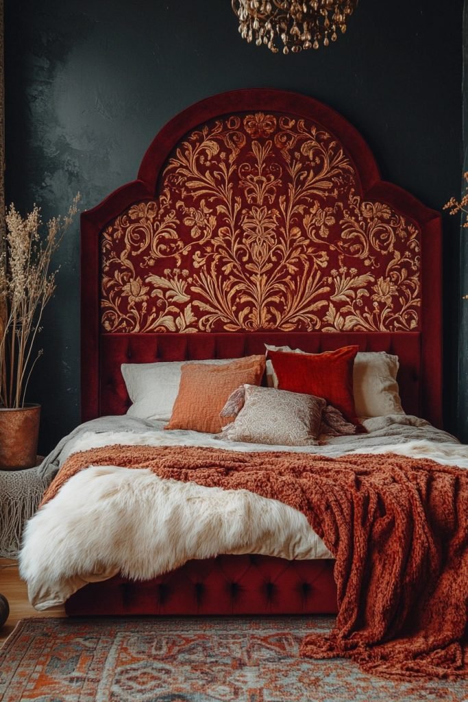
Firelight Glow pairs amber and burgundy to bring the warm, comforting colors of a firelit room into a boho bedroom. This palette can make the space feel intimate and warm, ideal for creating a cozy retreat. Rich, velvety fabrics and dark wood accents can enhance the warmth of the colors, making the room feel more enclosed and personal. Incorporate candle-like lighting to accentuate the glow of the room.
✎ Steal This Look
- Paint Color: Fine Paints of Europe Hollandlac Brilliant Amber Glow HL-4023
- Furniture: low-profile platform bed with carved dark wood headboard, vintage leather pouf, reclaimed wood nightstand with iron hardware
- Lighting: cluster of amber glass pendant lights with Edison bulbs, wrought iron wall sconces with candle-style LED, Himalayan salt lamp
- Materials: burgundy velvet, raw dark walnut, aged brass, handwoven wool in ochre and rust, distressed leather, beeswax candles
This palette demands you slow down—it’s the bedroom equivalent of a whiskey by the fire, not a morning coffee rush. Commit to dimmers or don’t bother.
10. Boho Rainbow

Boho Rainbow embraces multicolor brights for a dynamic and eclectic boho bedroom. This vibrant palette allows for a playful and creative decor style that stimulates the senses. Pairing these bright colors with neutral backgrounds like white or grey can prevent the space from feeling overwhelming. Accessories like colorful lanterns or eclectic art can accentuate the fun, free-spirited vibe of the palette.
💡 Steal This Look
- Paint Color: Backdrop Supermoon 01 — crisp white base that lets rainbow accents sing without competing
- Furniture: low-profile rattan bed frame with curved headboard, whitewashed mango wood nightstands, macrame hanging chair in corner
- Lighting: cluster of mismatched Moroccan brass lanterns in jewel tones (amber, ruby, emerald) at varying heights
- Materials: natural woven textures (jute, rattan, macrame), terracotta pottery, hand-thrown ceramic vases, vintage kilim rug with saturated rainbow stripes
This look is pure dopamine decor—it’s the bedroom equivalent of wearing every ring you own at once, unapologetically happy.
11. Pastel Paradise
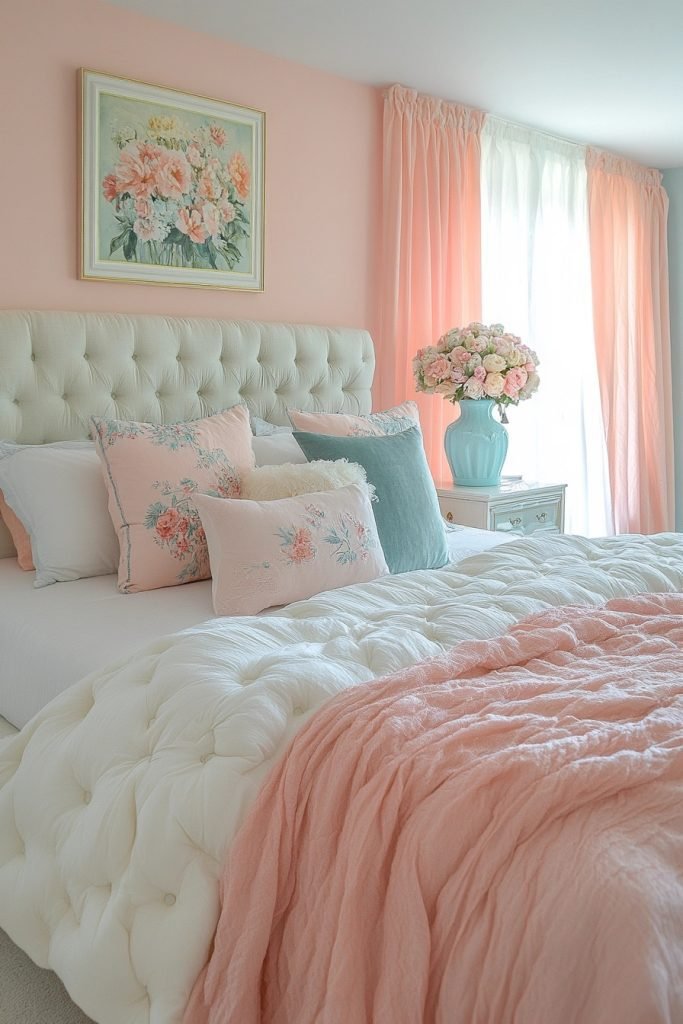
Pastel Paradise combines soft pinks and light blues to create a dreamy and whimsical boho bedroom. This palette is perfect for those who want a gentle, uplifting space. To enhance the dreamlike quality, add fluffy textiles and subtle floral patterns. Light woods and creamy whites can serve as a soft backdrop that lets the pastel colors shine.
💡 Steal This Look
- Paint Color: Sherwin-Williams Blush SW 7117
- Furniture: whitewashed rattan headboard, light oak nightstand with curved legs, cream upholstered bench with turned wood feet
- Lighting: macrame pendant with soft diffused bulb, ceramic table lamp with pale blue glaze
- Materials: chunky knit wool throws, linen bedding in dusty rose, cotton macrame wall hangings, raw edge light wood shelves, pressed flower art in thin brass frames
This look reminds me of sunrise light filtering through sheer curtains—there’s something quietly restorative about waking up surrounded by colors that barely whisper.
12. Desert Dusk

Desert Dusk features coppers and rusty reds to evoke the rich colors of a desert landscape at sunset in a boho bedroom. This warm palette is ideal for creating a cozy, inviting space that feels both grounded and vibrant. Incorporating natural textures like leather or woven wool can enhance the rustic feel of the desert colors. Accentuate this palette with sunset-inspired artwork or copper lighting fixtures.
🖼 Steal This Look
- Paint Color: Benjamin Moore Saddle Tan 1120
- Furniture: low-profile platform bed with leather headboard, vintage carved wood nightstands, woven rattan accent chair
- Lighting: copper dome pendant light with warm Edison bulb, terracotta table lamp with linen shade
- Materials: distressed leather, handwoven wool textiles, raw terracotta, aged brass, reclaimed wood with visible grain
There’s something deeply restorative about waking up surrounded by these earthy sunset tones—it feels like the room itself is exhaling after a long, hot day.
13. Celestial Shades
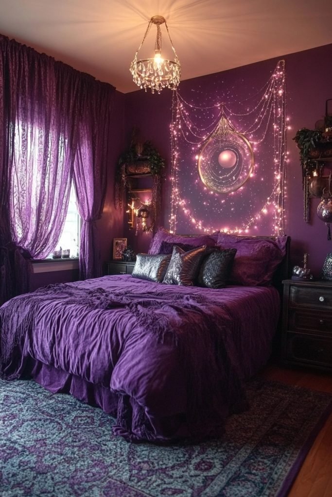
Celestial Shades uses dark purples and starry silvers to create a mystical ambiance in a boho bedroom. This palette is perfect for those who are drawn to the night sky and its serene mystery. To accentuate the celestial theme, use reflective metals and shimmering fabrics that catch the light like stars. Dark walls can serve as a dramatic backdrop for lighter, sparkling accents.
🏠 Steal This Look
- Paint Color: Farrow & Ball Pelt 254
- Furniture: low-profile platform bed with natural wood frame, vintage brass nightstands, macramé wall hangings with metallic thread
- Lighting: moon-phase pendant light, string lights with warm white bulbs, metallic starburst sconces
- Materials: velvet in deep plum, hammered brass, silver-threaded textiles, raw linen, dark-stained rattan
There’s something spellbinding about waking in a room that feels like midnight—this palette turns sleep into ritual.
14. Mediterranean Mood
Mediterranean Mood combines azure blues and whitewash to capture the breezy feel of the Mediterranean coast in a boho bedroom. This palette is ideal for creating a light, airy space that feels refreshing and calm. Using natural materials like rough-hewn wood or linen can add a rustic touch that complements the Mediterranean colors. White or pale stone floors can enhance the cool, open feel of the palette.
🌟 Steal This Look
- Paint Color: Behr Deep Azure MQ5-54
- Furniture: whitewashed rattan headboard with curved silhouette, distressed wood nightstand with wrought iron pulls
- Lighting: oversized natural woven pendant with visible bulb
- Materials: rough-hewn reclaimed wood, slubby linen bedding, terracotta accents, pale limestone or whitewashed floor
There’s something instantly transportive about waking up in azure and linen—it reads vacation, even on a Tuesday morning with emails waiting.
15. Autumn Whisper
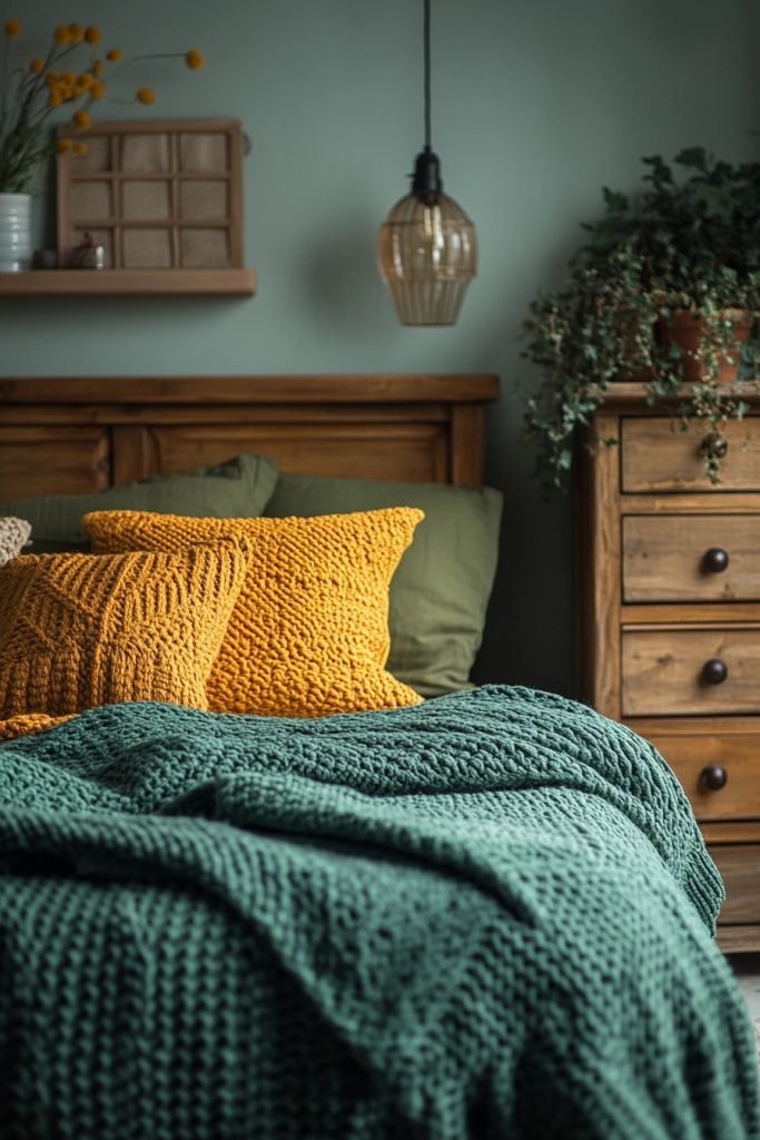
Autumn Whisper brings together olive greens and mustards, evoking the soft, muted tones of autumn in a boho bedroom. This warm, earthy palette is perfect for creating a cozy, inviting space that feels grounded and serene. Textures like chunky knits and felt can add comfort and warmth, enhancing the autumnal vibe. Subdued lighting can highlight the richness of the colors, making the space feel more intimate.
🏠 Steal This Look
- Paint Color: Valspar Autumn Fog 6004-2C
- Furniture: low-profile wooden platform bed with natural oak finish, vintage rattan peacock chair, woven seagrass storage bench at foot of bed
- Lighting: pendant with amber glass shade and brass hardware, table lamp with linen drum shade on warm wood base
- Materials: chunky hand-knit wool blankets, felted wool wall hangings, raw linen bedding, distressed leather accents, terracotta pottery
There’s something deeply calming about waking up surrounded by these harvest tones—it feels like the room itself is giving you permission to slow down and linger under the covers.
16. Nordic Nights

Nordic Nights uses a palette of black, white, and smoky gray to create a stark, dramatic boho bedroom. This color scheme is perfect for those who prefer a minimalist approach with a touch of bohemian flair. To soften the stark contrast, incorporate soft textures like plush rugs or fluffy pillows in shades of gray. Monochromatic art or simple, graphic prints can enhance the modern Nordic feel of the space.
🏠 Steal This Look
- Paint Color: PPG Black Magic PPG1001-7
- Furniture: low-profile platform bed with black metal frame, minimalist nightstand with clean lines
- Lighting: oversized matte black pendant with exposed bulb
- Materials: chunky knit wool throws, faux fur accents, raw linen bedding, light oak wood tones
There’s something quietly rebellious about a black bedroom—it’s cocoon-like, intentional, and lets you actually sleep.
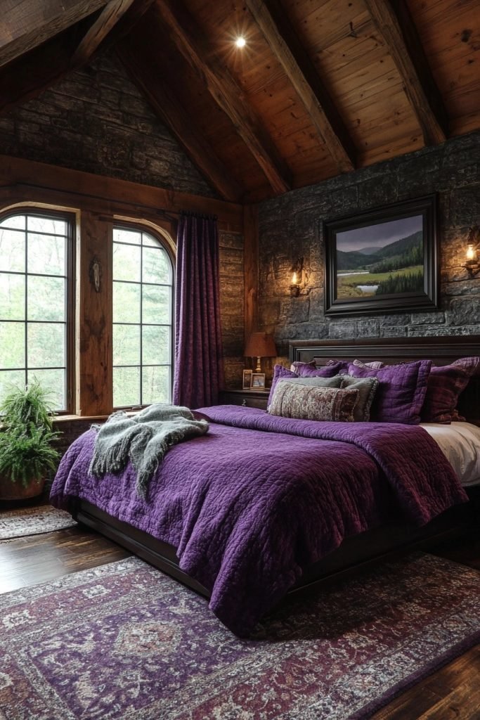
17. Mystic Indigo
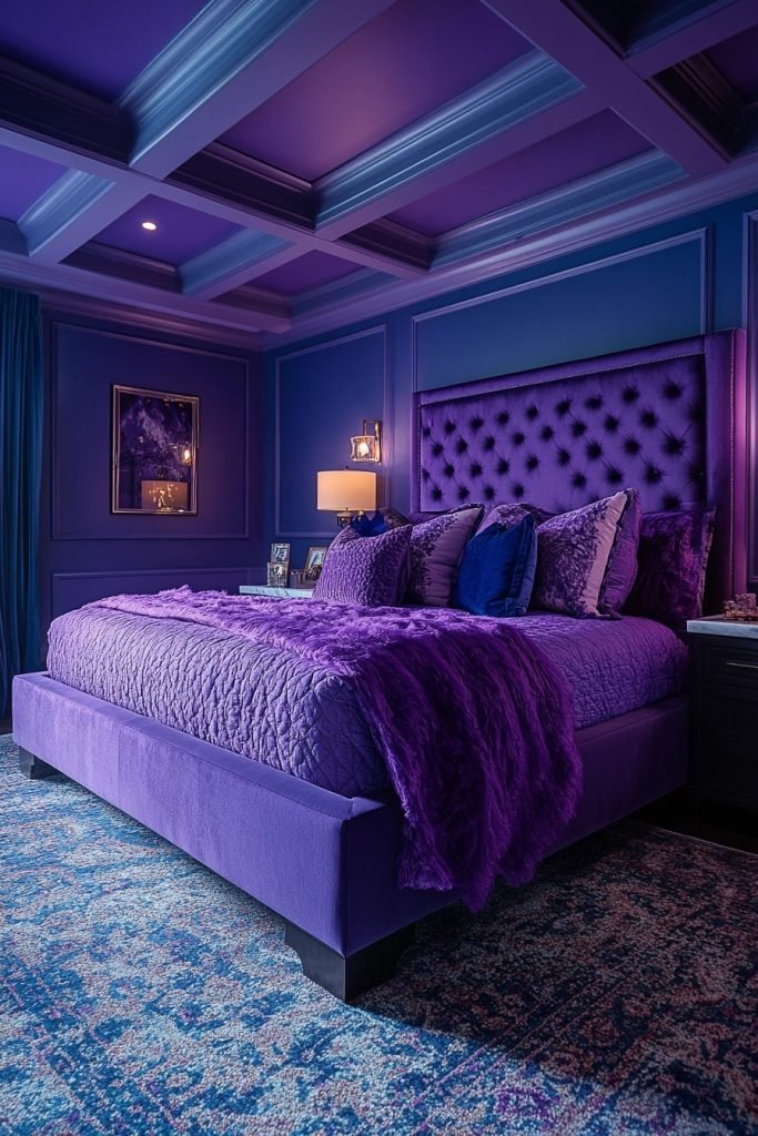
Mystic Indigo focuses on deep blue with violet accents to craft a rich and mysterious boho bedroom. This palette is ideal for creating a space that feels both regal and intimate. Satiny textures and glossy surfaces can reflect light and add depth to the dark colors. Subtle patterns in the same color family can add interest without overwhelming the space.
🌟 Steal This Look
- Paint Color: Dunn-Edwards Midnight Blue DET567
- Furniture: low-profile platform bed with velvet upholstered headboard, carved wood nightstands with brass inlay
- Lighting: oversized woven rattan pendant with warm amber bulb, brass swing-arm sconces with fabric shades
- Materials: velvet, raw silk, aged brass, dark-stained rattan, hand-knotted wool with indigo dye
There’s something spellbinding about waking up in a cocoon of midnight blue—it feels like sleeping inside a jewel box.
18. Berry Delight
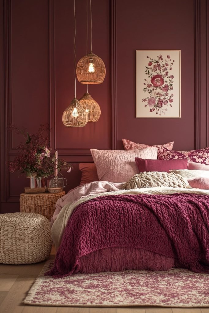
Berry Delight uses raspberry pinks and mauve to create a vibrant and playful boho bedroom. This color palette is perfect for injecting fun and femininity into the space. Soft textures and whimsical patterns in coordinating colors can enhance the playful, inviting feel. Light wood furniture and creamy whites provide a neutral counterbalance to the bright colors, keeping the room grounded.
🖼 Steal This Look
- Paint Color: Clare Paint Pink Sky 0053
- Furniture: light wood platform bed with woven rattan headboard, whitewashed nightstand with curved legs
- Lighting: macrame pendant light with warm brass accents
- Materials: chunky knit throws, velvet mauve pillows, natural jute rug, rattan baskets
This palette hits that sweet spot between grown-up sophistication and the unapologetic joy of your favorite childhood bedroom—it’s fearless femininity done right.
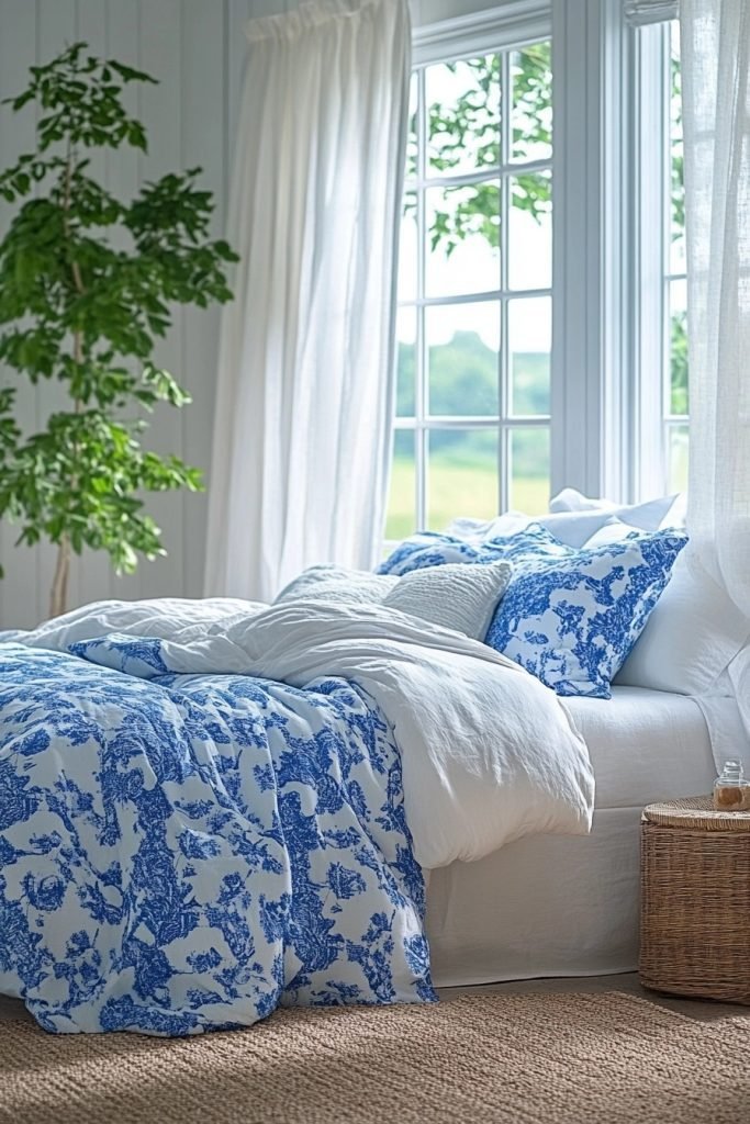
19. Coastal Cool
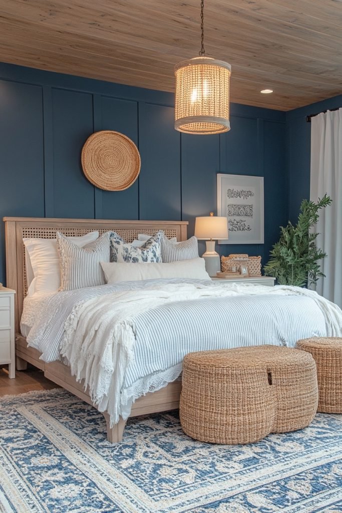
Coastal Cool combines navy blue and soft white to evoke the crisp, clean feel of a coastal boho bedroom. This palette is perfect for creating a serene, nautical-inspired space that feels both fresh and tranquil. Striped patterns and natural fibers like cotton or jute can add a maritime touch without resorting to clichéd decor. Pale wood and glass accents can keep the space light and airy.
🎨 Steal This Look
- Paint Color: Fine Paints of Europe Hollandlac Brilliant Navy Blue 4003
- Furniture: whitewashed rattan headboard, pale oak nightstands with woven cane doors, natural jute area rug
- Lighting: glass globe pendant with brass hardware, linen drum shade table lamps
- Materials: navy linen bedding, chunky cotton knit throws, seagrass baskets, weathered driftwood accents, striped ticking fabric
There’s something about waking up in a navy-walled coastal boho bedroom that feels like sleeping inside a storm cloud over the Atlantic—dramatic yet utterly peaceful.
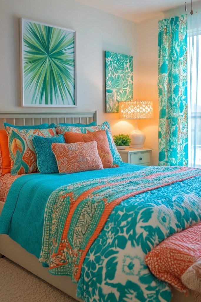
20. Gypsy Jewel

Gypsy Jewel features vibrant turquoise and jade to create a dynamic and exotic boho bedroom. This palette is perfect for those who want a bold, spirited space filled with energy. Incorporating metallic gold or brass accents can enhance the richness of the colors, adding a touch of opulence. Rich textures like velvet or silk can add depth and luxury to the vibrant hues.
🏠 Steal This Look
- Paint Color: Backdrop Gypsy Jade 0024
- Furniture: Carved wood headboard with brass inlay, vintage turquoise velvet bench at foot of bed, rattan nightstands with gold hardware
- Lighting: Moroccan brass pendant with intricate cutout patterns casting jewel-toned shadows
- Materials: Turquoise silk pillows, jade velvet throw, hammered brass trays, embroidered suzani textiles, aged wood with ornate carvings
This palette demands confidence—I’ve seen it fall flat when homeowners chicken out and mute everything to beige. Commit to the jewel tones or don’t bother.
21. Frosty Dawn
Frosty Dawn uses pale gray and soft peach to create a gentle, soothing boho bedroom. This palette is perfect for crafting a space that feels soft and ethereal, ideal for relaxation and contemplation. Light, flowing fabrics and minimalistic furniture can enhance the airy feel of the colors. Subtle touches of silver or pearl can add a frosty shimmer, reminiscent of early morning light.
💡 Steal This Look
- Paint Color: Sherwin-Williams Morning Fog SW 6255
- Furniture: low-profile platform bed in whitewashed oak, floating nightstands with clean lines
- Lighting: sheer linen pendant with warm LED bulb, delicate fairy lights draped behind sheer canopy
- Materials: linen bedding in soft peach, gauzy cotton curtains, brushed silver accents, raw wood textures
There’s something almost meditative about waking up in this misted palette—it feels like the room itself is still waking up alongside you.
22. Moroccan Spice
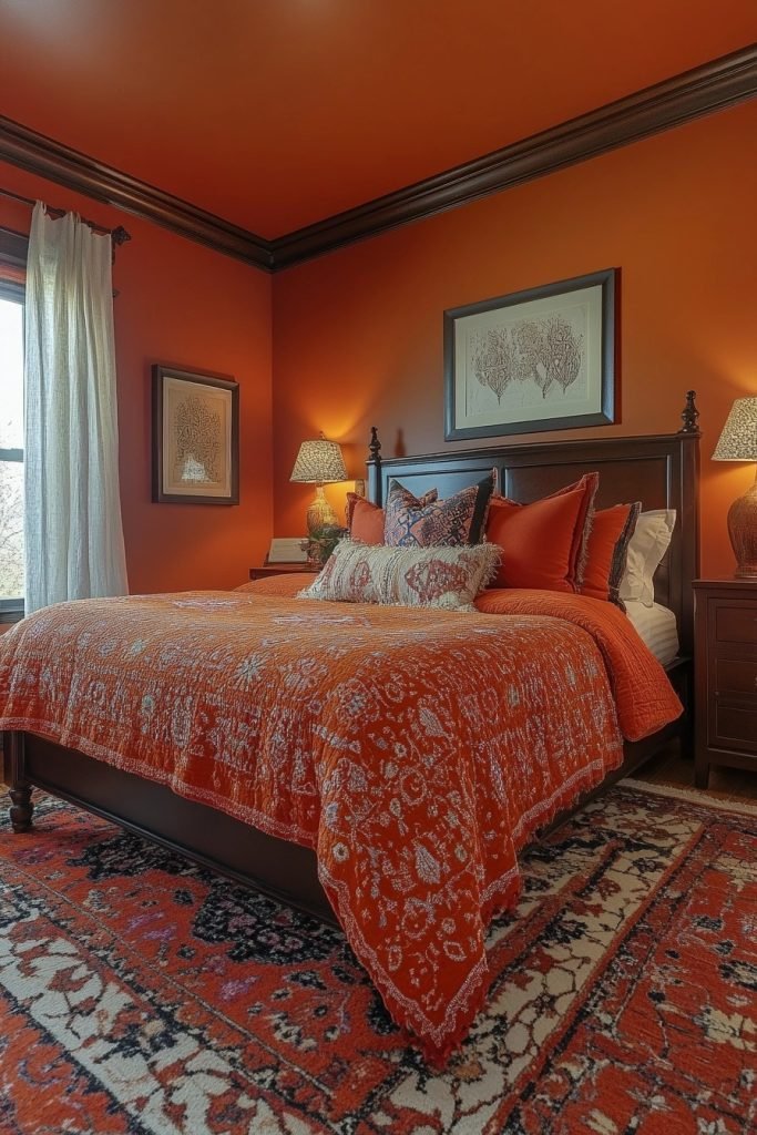
Moroccan Spice brings bold oranges and reds to the boho bedroom, evoking the vibrant energy of a Moroccan bazaar. This palette is perfect for creating a warm, inviting space that stimulates the senses. Rich, patterned textiles and ornate lanterns can enhance the Moroccan feel, while dark wood furniture provides a grounding element. Vibrant wall art or colorful tiles can add authentic Moroccan flair.
★ Steal This Look
- Paint Color: Benjamin Moore Moroccan Spice 1309
- Furniture: carved dark wood platform bed with turned legs, ornate brass-accented nightstands
- Lighting: pierced metal Moroccan pendant lantern with warm bulb glow
- Materials: handwoven kilim rugs, embroidered suzani textiles, hammered brass, glazed zellige tile accents, tasseled linen
This palette reminds me of a riad courtyard at sunset—warm, lived-in, slightly mysterious. The key is balancing that fiery energy with enough dark wood and brass to keep it grounded.
23. Tranquil Retreat

Tranquil Retreat uses sage green and dove gray to create a calm and balanced boho bedroom. This palette is perfect for those seeking a space that feels grounded and soothing. Natural materials like stone or unfinished wood can complement the earthy tones, enhancing the tranquil vibe. Soft, plush textiles in coordinating colors can add comfort and warmth, making the bedroom a true retreat.
🎨 Steal This Look
- Paint Color: Farrow & Ball Green Blue 84
- Furniture: low-profile rattan bed frame with woven headboard, unfinished wood nightstands with live edges, stone-topped dresser
- Lighting: oversized linen drum pendant, ceramic table lamps with unglazed bases
- Materials: raw linen bedding, chunky hand-knit wool throws, jute area rug, unpolished stone accents, bleached oak
This is the bedroom you crawl into after a brutal Tuesday—soft, quiet, and deliberately unhurried. The green here isn’t trendy; it’s medicinal.
24. Highland Hues
Highland Hues combines heather purples and mossy greens to evoke the rugged beauty of the Scottish highlands in a boho bedroom. This palette is perfect for creating a space that feels both wild and cozy. Tweed or woolen textiles can add a rustic touch, while soft lighting highlights the depth of the earthy colors. Incorporating natural elements like wood or stone can enhance the connection to the highland landscape.
🎨 Steal This Look
- Paint Color: Behr Heather Haze MQ5-52
- Furniture: low-profile wooden platform bed with live-edge headboard, vintage leather trunk at foot
- Lighting: wrought iron pendant with amber glass, bedside sconces with fabric shades
- Materials: chunky hand-knit wool throws, raw-edge wood nightstands, slate stone coasters, tweed accent pillows
This palette demands you slow down—it’s the bedroom equivalent of a foggy morning walk through the moors, best enjoyed with thick socks and nowhere to be.
25. Urban Chic
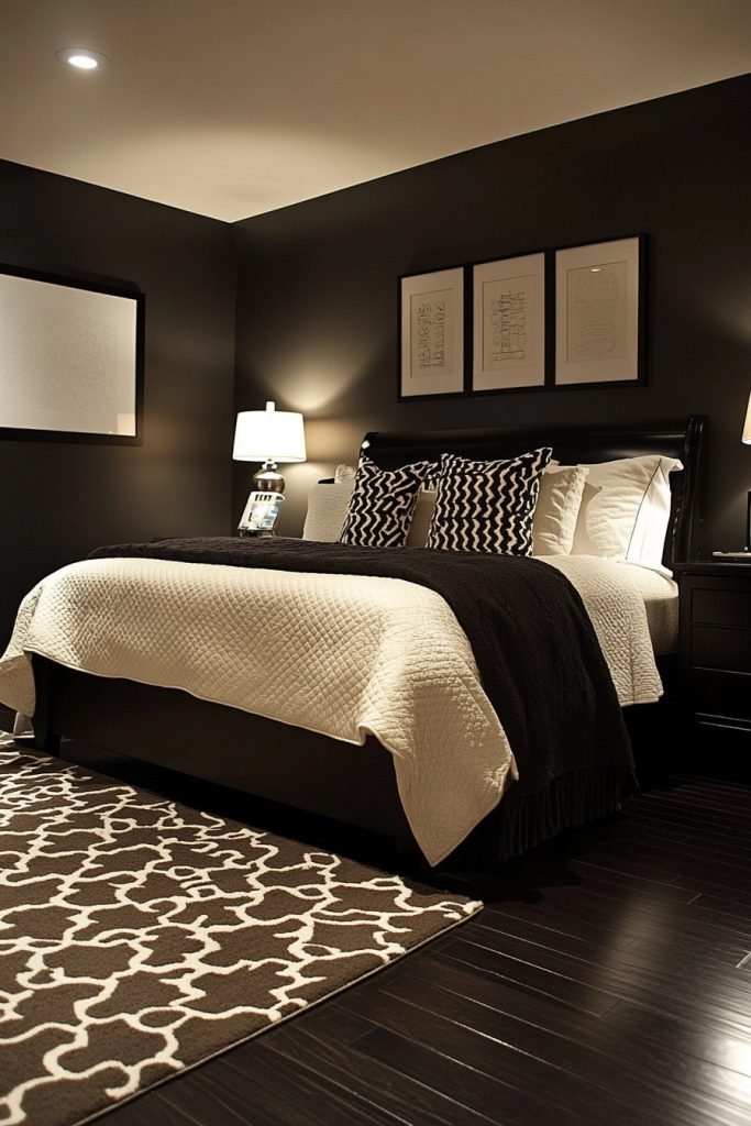
Urban Chic uses charcoal and cream to create a sophisticated boho bedroom that blends urban edge with bohemian warmth. This palette is perfect for those who prefer a more modern take on boho style, combining sleek lines with soft, inviting textures. Monochromatic art and minimalistic decor can keep the space feeling chic and uncluttered. Textural contrasts, such as a shag rug or knit throw, can add depth and interest.
🏠 Steal This Look
- Paint Color: Valspar Charcoal Blue 4008-2A
- Furniture: low-profile platform bed with clean lines, streamlined nightstands with hairpin legs
- Lighting: geometric black metal pendant or matte brass arc floor lamp
- Materials: chunky knit wool, faux sheepskin, raw linen, blackened metal, light oak accents
There’s something quietly rebellious about pairing bohemian softness with urban restraint—like wearing a vintage band tee under a tailored blazer. This look rewards the confident minimalist.
26. Carnival Brights
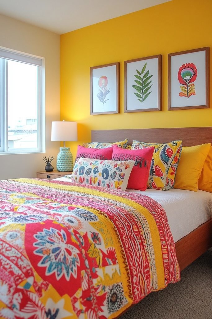
Carnival Brights features fiery reds and sunny yellows to create a lively and energetic boho bedroom. This palette is perfect for those who love a bold, festive atmosphere that’s full of life and color. Bright, patterned textiles and vibrant wall art can enhance the carnival vibe, while simple furniture in neutral tones keeps the room from feeling too busy. Incorporating elements like colorful glass or shiny metal can add a playful touch.
🎨 Steal This Look
- Paint Color: PPG Fiery Red 14-17
- Furniture: simple whitewashed wood platform bed, natural rattan nightstands
- Lighting: brass pendant with colorful glass beads
- Materials: woven jute rugs, macramé wall hangings, terracotta pottery, hammered brass accents
This look demands confidence; I love how the carnival energy wakes you up, but the secret is letting those saturated hues breathe against quiet, organic foundations.
27. Bohemian Blues

Bohemian Blues combines cobalt and cerulean to create a cool, calming boho bedroom. This palette is perfect for crafting a space that feels both serene and deeply reflective. Lighter shades of blue can be used in textiles and wall colors to maintain a light, airy feel, while darker blues add depth and focus. Natural materials like bleached wood or woven baskets can complement the blues, enhancing the bohemian feel.
💡 Steal This Look
- Paint Color: Dunn-Edwards Cerulean Skies DE5858
- Furniture: low-profile platform bed with bleached oak frame, vintage rattan peacock chair, distressed blue-painted nightstand
- Lighting: oversized woven rattan pendant with warm Edison bulb, brass swing-arm wall sconce
- Materials: hand-loomed indigo-dyed textiles, raw cotton macramé, weathered driftwood, glazed terracotta, chunky wool throws
This is the bedroom for anyone who wants to wake up feeling like they’re floating in a Mediterranean afternoon—cool, calm, and quietly romantic.
28. Monochrome Magic

Monochrome Magic creates a bold and striking boho bedroom using only black and white. This palette is perfect for those who appreciate the dramatic contrast and visual impact of monochrome. Patterns play a key role in this style, with geometric or tribal prints adding complexity and interest. Minimalist furniture and decor can keep the space from feeling cluttered, while textured black or white textiles add warmth and depth.
💡 Steal This Look
- Paint Color: Clare Paint Whipped CODE
- Furniture: low-profile platform bed with black metal frame, minimalist white nightstand with cane drawer front
- Lighting: oversized black rattan pendant light
- Materials: chunky white knit throws, black macramé wall hangings, natural jute rug with black geometric pattern
This look demands confidence—lean into the contrast and let the textures do the talking. It’s surprisingly serene once you commit.
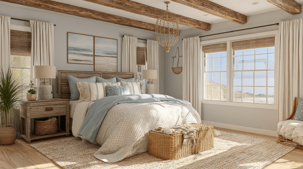
29. Ethereal Elegance
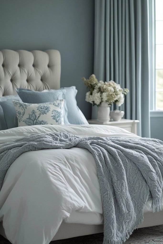
Ethereal Elegance uses soft gray and tranquil blue to craft a light, ethereal boho bedroom that feels like a peaceful sanctuary. This palette is perfect for creating a space that invites relaxation and contemplation. Light, flowing fabrics and delicate textures enhance the airy feel, while minimalist decor keeps the focus on the soothing colors. Subtle metallics or glass accents can add a touch of elegance without overpowering the serene vibe.
💡 Steal This Look
- Paint Color: Fine Paints of Europe Hollandlac Brilliant Pale Blue 4003
- Furniture: low-profile whitewashed wood platform bed with turned legs, rattan peacock chair, driftwood nightstand
- Lighting: oversized linen drum pendant with brass hardware, cascading fairy lights draped behind sheer canopy
- Materials: washed linen bedding, bleached jute rug, seagrass baskets, mercury glass votives, raw cotton macrame
This palette whispers rather than shouts—perfect if you want your bedroom to feel like a exhale at the end of the day, not a statement piece.
Conclusion
In conclusion, the right Boho Bedroom Color Palette can be the key to transforming your space into a cozy, vibrant sanctuary that reflects your unique style. With these 29 Boho Bedroom Color Palette Ideas, you now have the tools to mix and match colors in a way that feels effortless yet stylish. Whether you’re drawn to earthy tones, bold accents, or calming neutrals, there’s a palette here for every taste. So, go ahead and experiment with these color combinations to create a bedroom that’s both inviting and full of personality!